December 13, 2013

Look For Two Robins This Christmas

The robins are back once more. Twice more, actually. There is the 'normal' festive stamp using the robin image from Birds I and most have the MA12 code but a few are emerging now with MA13 and are worth looking out for as they're likely to be decidedly scarcer (although we may have to wait until next year to be sure!)


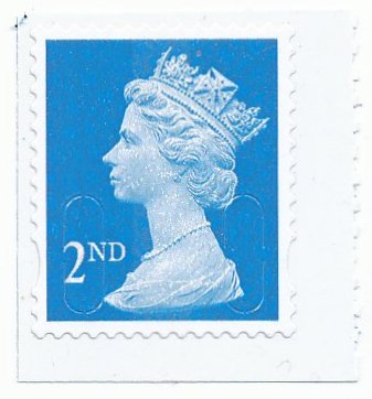
This version has type 2 font.

Apparently there is also a mobile Post Office running around the country for reasons not entirely clear. This serves out Robin Christmas Post And Gos from the Hytech machine producing font type 3a.


The sharp-eyed among you may spot that the latest 2nd and 2nd Large Post And Gos sport synchronised phosphor bands which don't stop short of the edges as the originals did. Something at a reasonable price, at least, to add to your collection.


As 2013 draws to an end it seems odd that there are still MA13 codes appearing which, presumably, cannot have been around long and may not be for much longer either. What some commentators describe as the last of the MA13 codes could be these two 1st Large stamps. One is from a Business sheet with code B and the other a book of four with code F.


Lastly there's a 1st red with very bright fluor, code T from recent Walsall books of 12.


That may well be it for 2013. But you never know. Before we get too excited about MA13 codes on stamps in the last fortnight of the year, however, remember that we are still using MA12s for lots of values and if stocks are large we may well be seeing MA13 until 2015 of some values. That is part of the fun of collecting, isn't it? No matter how many standing orders, friendly counter staff, intensely aware specialists or dealers that we may associate with, anything can happen - and often does - to catch us all unaware and rarities, oddities and the simply bizarre will be greeting us again in 2014.

November 14, 2013

Royal Mail staff gift pack.


In the old days, Royal Mail staff occasionally got stamps that were slightly different to the sheets we would get at a Post Office so I was delighted when my local postman brought his staff gift round this morning and let me have it.

OK, so it's a sheet of the Children's Christmas 1st Class and not some nice Machins but my heart began to race when I looked a bit closer and couldn't see any phosphor bands. I did try checking on-line but failed to get any technical printing details. The best I could find was that the stamps would have bars as appropriate. Great.

Being quite late in the day I was not inclined to dash out and buy a 'normal' sheet over the counter at a Post Office for comparison so I tried looking again. It seems that there are bands but they must have been so precisely positioned - covering exactly the wide white area to the right and exactly the very narrow strip of white from the design to the perforations on the left. On first glance, even seventh or eight glance, you just think that the 'shading' is the different reflection from the part of the stamp not printed with the kid's drawing. To test that I tried viewing stamps at an angle but from a side rather than the bottom. Ah ha! Now there is no 'shading' so what I see on the left and right must be phosphor bands after all.

So, presumably, there is nothing special about these staff gift packs this year, other than a card from the boss. Just to emphasise the point that I really needn't have either bothered nor got particularly excited this year, I was successful in buying a complete staff gift pack of two sheets of 25 plus the card for less than the face value of the ruddy stamps this afternoon!

Now, if I sell all 75 stamps I'll have almost enough to buy the UV lamp I need so that I don't get confused any more. I shall also be able to tell the difference between yellow and blue phosphor and even get a grip on things called fluor and maybe even iridescence! My regular supplier of all things different keeps firing these at me and they look exactly the same as each other so I might finally be able to appreciate what I'm spending my money on.


November 12, 2013

Christmas - but which way round?

I keep looking at the 'Coptic' design £1.88 value Christmas stamp and wondering if it is just my view or whether, indeed, Mary's hand is wrong. Jesus' fingers are a bit strange too but that doesn't trouble me too much. The artist, Fadi Mikhail, who created this image using ancient techniques and did so specifically for this issue, mentions in a recent interview, published in the November British Philatelic Bulletin, that it is very difficult to correct errors. Perhaps that explains it.


Below I illustrate a similar pose on another stamp which, to me, is much more naturally angled.


November 07, 2013

Regional shades

Some quite distinct new shades appeared earlier this year in the Regionals. I have mentioned the English one in an earlier post and now can illustrate the Wales, Northern Ireland and Scotland printings.

I have shown the original 2012 versions. They're the second illustrations in each case.
The Wales 88p is much more blue than before and easy to distinguish.

The Northern Ireland 88p is now almost devoid of the green shade, now simply grey.

Not easy to spot individually maybe, but quite clear when you can compare side by side with the earlier printing, here's the Scotland 2nd with a much more slate blue colour.

The Scotland 1st hasn't changed colour but the phosphor is now described by B Alan as 'vignetted'. Much less distinct edges towards the centre of the stamp.


October 31, 2013

Christmas by kids.

These are the cheerful designs for Great Britain's Christmas stamps this year. There is also a range of Madonna & Child stamps available but these are the ones that seem to be grabbing the limelight.

There was a competition and children were invited to send in their designs. From thousands of entries these two were chosen. I find these so familiar but can't figure why. 

Illustrations from Royal Mail and available to buy from 5 November from them at this link.


Snow for Christmas and even less visible Freshwater Life


Wincor Font Type 2 What you'll find at Post Offices

Hytech Type 3 This is what was in Presentation Packs

Hytech Type 3a from Autumn Stampex 
There are now three variations of the Freshwater Life 3 Post and Gos. The usual two - type 3 ones you'll never see unless people break up their Presentation Packs and type 2 ones you might see if you're lucky to have friends or clients who use Post and Gos and then there's the very rare variety, type 3a, which someone could only have obtained on a couple of days at an exhibition.

I have just shown singles above to make it clear what the font and layout differences are. The Presentation Pack strip is 6 x 1st Class and was illustrated in my last post.


2nd Large finally appear in booklets with MA13 and F codes.


Some M12L Code Ts from Walsall books have been found with a really snowy print, very obvious on closer view as the illustration below shows.


The De La Rue 2nd counter sheet belatedly gets the MA13 code too. You would have thought this one would have been needed ages ago but perhaps people stocked up heavily on the MA12s and are only now going back to ask for more.


September 28, 2013

More MA13 codes, fish and new Regional shades

Here's some freshwater life you won't find on your envelopes. These are the Post Office Presentation Pack editions. Not that you'll see that many of the 'real' ones printed by people on machines in Post Offices either. They'll be illustrated when I get them so you can see the differences which I expect will be the same as for Freshwater Life I and II but you never know.


Another Post And Go issue you may easily miss. This is the Union Flag with a Coronation overprint and with MA13 in the background. These were available only, to my knowledge, at the Stampex Exhibition earlier this month. As it seems unlikely that the same issue will be available with that overprint and in that typeface again, these could be pretty rare.

Two new Regionals appeared from May. They're not Machins, but I like them. All the Regional pictorial designs are getting pretty ancient and I am quite surprised they've lasted as long as they have. These two are Cartor reprints and the olive has become distinctly sage and the Scottish 88p much deeper.


As for Machins - you can now look out for a 10p tan, 1st red and 1st Large red, all three from De La Rue counter sheets with MA13 and no code letter and 2nd Large blue with MA13 MBIL from Walsall business sheets. My lists have been updated with these items.
Posted by Picasa

September 21, 2013

Horizons. Getting a little clearer.

I tried very hard to distinguish between the various Horizon gold labels I had, using various sites written by people with a lot better knowledge than me. You may have read the earlier post and it was a reasonable effort but I did find some of the material I was using very confusing. So I bought a pile of unsorted stuff and looked again. Here are the results, which do tie in with the erudite and the expert posts elsewhere but, perhaps, mine will be a little simpler to refer to for beginners sorting their bundles.

Well, until there are more differences discovered and the slits could well be a case in point ( I have that 1/2a feeling coming on which those who read an earlier post about self-adhesives will appreciate!)

So, here we go. My type 1 is the original with fat font and pretty obviously different.

#1 Perf Font 1 Date // No code Slit 1 DLR
 Type 2 has a thin font and a different date style.

#2 Perf Font 2 Date - -  No code Slit 1 DLR
Type 3 reverts to the // date style 
#3 Perf Font 2 Date // No code Slit 1 DLR
 Type 4 is Type 3 with a code

#4 Perf Font 2 Date / / Code Slit 1 DLR
Type 5 is an imperf version of Type 2 and one expert remarks that there are bigger gaps in the curves introduced at this time. I'm not convinced that this only applies to the imperforate ones but can't find any more anywhere about this so I won't confuse things yet. I am sure I have two different types of slits in the perforated labels. Something for another day.
#5 Imperf Font 2 Date - - No code Slit 2 DLR
Type 6 is an imperf version of Type 3 
#6 Imperf Font 2 Date / / No code Slit 2 DLR
Type 7 is an imperf version of Type 4 
#7 Imperf Font 2 Date // Code Slit 2 DLR
Type 8 is Type 7 with different slits - just down the sides 
#8 Imperf Font 2 Date // Code Slit 3 (side only) DLR
Type 9 is the Walsall print of Type 8 with a slightly different background construction and very slightly bigger gaps in some curved slits. I'm not sure the illustration below is Walsall - I will try and publish a magnified version of each of the most recent De La Rue and Walsall ones as it is not easy to tell the difference.
#9 Imperf Font 2 Date // Code Slit 4 Walsall
 Now I know that others are using different numbers and types. Once it has all settled down and one of the series becomes definitive then I will adopt that one. For now, they're just Types 1 to 9 in my list! Sorry if that is troublesome but I can't decide which to follow yet.
Posted by Picasa

September 19, 2013

Ships, a Morris Minor van and two new Machins

This week sees the Merchant Navy prestige book and a new 6 1st book of the 4 Machins +2 special issue type. The special issues stamps are interesting in that the prestige book has an Enschede pane with the Royal Mail Ship stamps gummed but the small book has a Walsall self-adhesive version.

There is also a nice pane of four stamps in greyscale which I think are just illustrating the Merchant Navy (the others being part of Post Office transport). The four Merchant Navy stamps have no text at all, just the 1st denomination. As I write this, I cannot quickly recall another issue, other than definitives, that have had no descriptive text but that is more likely to be down to poor memory than an indication of anything significant.

I shall give that more thought before I am inundated with comments highglighting something terribly obvious.

Anyway, that's about as much attention as I have ever paid to special issues - on to the Machins. The 5p is new in several respects. Its gummed with security features. OK, so far, similar to Dr Who and Football book panes - except this is Enschede, not Cartor and Dr Who was M12L anyway. But there is another difference too - for the first time I have noticed, the ellipses in the perforation are near the top, not the bottom.

The 5p also looks a duller, more grey shade. The 50p is the first gummed version in the slate colour. So lots of new entries for this pane.


The small book is as expected - M13L MPIL codes and what I assume must be type 2a slits. We've seen these before.
 
Posted by Picasa

September 13, 2013

Stamp Collecting After Privatisation: First Thoughts


Will forthcoming changes at Royal Mail affect stamp collecting? That's the question being asked and I have to admit that it hadn't occurred to me that there was any change to stamps coming but I guess I do need to think about that now. I'd just seen it as a change in contracts for parcels in the main but I guess it could be much more dramatic.

Privatisation will mean that neither the Government nor HM The Queen need have any say in the services being offered by what is presently called Royal Mail. I should imagine that there would be some pretty strict conditions laid down if the trading name Royal Mail were to continue to be used by one or other of the private enterprises taking over. That would, I should hope, mean controls over how the monarch's head is utilised, advertising associations (she may well not wish to be shown aside a Big Brother advert, for instance) and with security features embedded in printing of labels to ensure that forged items do not flourish and impact adversely upon our Head of State's reputation for trust and reliability.

Use of the phrase stamp collecting does rather assume that there will be labels of some sort to collect, of course. Whatever the method of purchasing delivery, one would expect that there will be a continuing need for some sort of label to confirm that delivery has been paid for. There has been an increased use of Horizon labels and PostAndGo labels taking the place of what we normally think of as stamps and I think it is fair to say that the big gold things have not endeared themselves to a new generation of collectors. The fact that they feature a massive Machin head has, however, kept a degree of interest amongst dedicated followers of Machin like myself and I am anxiously trying to maintain a complete collection of each type issued.


The PostAndGo labels are not as widely seen, being available at a comparatively limited number of offices still and, of course, people still have the normal choice of definitives and special issues at Post Office counters and books of NVIs at many outlets.


They are definitely more likely to get a wider following as they look quite cute and come in sets and appeal to young and old collectors alike. If they continue, that is.

There are masses of special issues each year - this year's topics being as diverse as Dr Who and the 150th Anniversary of the Birth of Bertram Mackennal. I have always had doubts about how many of these ever actually reach envelopes or packages, though. I suppose they are collected but some new organisation should be able to continue to churn out sets every month or so and they'll continue to be bought. I don't think special issue collectors are, in the main, that bothered about the Queen's head either. So special issues should be a nice little way of making a few shillings for the new people and need have nothing to do with postal services really.

What will be affected will be the collection of definitive stamps. I see a continuing market for Horizon or PostAndGo type labels, with or without the Queen's head - so they will be bouyant whatever happens, albeit in a modest size, mostly quite specialist market. So too should the pictorial definitives be as collectible, not that there are very many anyway. Some readers may never have seen this, for instance!


It is the Machins that this will eventually be all about. This internationally praised and much-loved series started in 1967 and, even to the surprise of some of its biggest fans, is still going strong 46 years on.


If the service continues with permission granted for continued use of the Queen's head (whether or not called Royal Mail) then all will be well. There could, indeed, be a decided increase in sales for a while as there will be lots of publicity, new rates and, possibly, new printings with all the fun and games that that will imply! To many collectors like me, that would be a wonderful time. I remember missing all the rapid rate changes in 1989-90, the double head 150th anniversary of the Penny Black issues and lots of stamps in books with all sorts of variations of straight cut edges, printers, gums and so on. It took ages to track all the variants down some years later so I will be one of many determined not to miss a thing this time!

Even if there are several competing firms within the new delivery service, and a choice for customers as to how they get a letter from here to there with all the different styles and types of labels to evidence the process, I would think that the very diversity will have some appeal - even if, for my own part, I would be inclined merely to stick to the Machins.

What would I do if the Queen's head were to go, though? Well, that would end the Machin series and there would be a great deal of philatelic weeping and wailing but it has to occur at some point so 2013 is a good as any, I suppose. Much depends on what replaces these stamps. I will almost certainly start with whatever is produced and many others will too, just in case they prove valuable, short-lived or meet any one of many criteria for apparent monetary gain and the satisfying feeling that gives (even if we never have even the remotest chance of selling any!)

Something well-designed will appeal and be collectible again and probably appeal and sell quite widely. I see British scenes being a theme - there was a great set of stamps issued recently in an A-Z of Britain which was beautifully produced and would be very popular. I doubt that many will have seen them - a reissue would save a lot on design fees too.

For me, something not well designed will also be collectible. I really quite look forward to getting hold of the early efforts at getting labels right that some of the new service providers will be doing. I hope they make mistakes, spell things wrong, change fonts, gum, paper, printer...

So, it would seem, and it has only been after scribbling all this that it is clear; I will continue to collect and the changes will, if anything, have me and thousands like me spending more than ever. For a while, at least.


Machin Self Adhesive slit types. Why did I bother?

I had this bright idea of helping collectors avoid the eye strain I have been experiencing in trying to distinguish between the types of slit in Machin self adhesive stamps. I thought I would scan an example of each and that would be that. However, it isn't at all obvious but, as you'll discover at the end, it may not matter a great deal anyway, once you have tucked three items from 2009 away.

So, according to the lists I have from dealers, the 1st Large red issues are an ideal example as they come in each of types 1, 2 and 2a and have different security codes so my job is comparatively simple. There is only one source of type 3 that I have seen listed so that is even simpler - the 50p, 1st gold and 2nd blue stamps in the definitive pane in the George V book.

So, here we go:

Type 2 from the Walsall MA12 MFIL books of 4
 That's pretty clearly different from the others, obvious gaps top and bottom.

Type 1 from the Walsall MA12 MBIL Buisness sheets
This is where I have trouble - distinguishing between types 1 and 2a 

Type 2a from DLR MA12 MAIL Counter sheets
 I really struggle to see much difference between the two. The illustrations in dealers' lists do say 'less noticeable' slits but, my goodness, these are so much less noticeable to be almost non-existent.

Type 3 from the Walsall George V prestige book MA10 MPIL
No problems with type 3. The lack of gap at the top and decent gap at the bottom is clear.

I tried zooming in on the images, sharpening them and using greyscale to try and make the differences clearer but it is still one big struggle to tell 1 and 2a apart. I am beginning to wonder whether the list I am using has got it wrong.

Type 1

Type 2a

Tye 2

Type 3
There is definitely something I need to look into further. In the meantime, here are images of two examples of the 2nd Large where the difference is a bit clearer and that should help you a bit. Just watch your eyes with those 1st Large reds!

Type 2a DLR MA12 MAIL from Counter sheets

Type 1 Walsall MA12 MBIL from Business sheets

Again, you have the different printers here and codes too and, so far, there are only three instances where I can find types 1 and 2a listed for otherwise same stamps (codes, printer being the same).

These three are:
2nd blue DLR 2009 MBIL Business sheet
1st gold DLR 2009 MBIL Business sheet
1st Large gold 2009 MAIL Counter sheet

Let's cross our fingers and hope like mad that there are no more. then, quite frankly, it won't really matter whether it's 1 or 2a.

Posted by Picasa