August 30, 2013

Fresh Freshwater Life emerges

Freshwater Life II Post and Gos now have three types: from the top in this illustration, Type 3 from the presentation pack, Type 2 from machines in offices up and down the country and now Type 3a which comes from machines Royal Mail installed at two regional exhibitions in Leamington Spa and York on 6 July. As these would only have been available for a limited period of a day and Freshwater Life III stamps will be used at the next outings, it looks like these will be extremely scarce indeed.


Next in a weird month comes an 87p Northern Ireland pictorial definitive in a distinctly darker shade. I should have compared it to an original 87p, I know. Only just noticed it was an 88p I used!


Next, coils of 10000 1st gold Machins were produced by Enschede for large distributors and the later ones had a MRIL MA12 code, making this the first, albeit belated, appearance of that code on the 1st gold.


The 20p has now emerged with the MA13 code as predicted.


Walsall booklets of 12 2nd blue CB code M11L MTIL with bright fluor have appeared on the scene. The booklet was the PIP cover without printer information and all previous books have had dull fluor.


Background information courtesy of Messrs B Alan & Co who are much better at this fluor stuff than I am. I must buy some gadget for viewing this. Any recommendations?


August 07, 2013

Christmas Past and Seldom Seen

Here are the top val;ues from this Century's Christmas sets - the ones you may well never have seen on mail unless you were fortunate enough to have a few parcels sent by post from relatives or friends in the UK who also went to Post Offices and bought stamps!

These are certainly an odd bunch! The image for 2008 is a strange choice and quite scary, whilst for 2006 it was hardly worth the effort.

I shall cover previous issues next time.
2012
2011
2010
2009
2008
2007
2006
2005
2004

2003
2002
2001

The World Comes And Goes

I now have another strip of Post and Gos from the Australia EXPO thing - the same as the last one but I do have two 1st Class ones with the World missing from the AU printings.

You'll recall that the GB printings had World Stamp Expo 

Are these things ever going to go mainstream? Royal Mail are certainly putting a lot into establishing more and more locations where people can buy them but they are still barely known outside the collectors' fraternity and, perhaps, a few who live close to one.

The British quite like queueing and having a human being to take their letter or parcel, do the honours and tell them how much to pay. It's pretty simple and it works. The staff even have the big gold Horizon labels to slap on so they don't have to work out which combination of sheet stamps will add up to the sum required. Now that makes me wonder who on Earth now buys the sheet stamps! And we can see just how many aren't being sold by the dearth of 2013 codes so far this year.

Going back to the Post and Gos, there are several things wrong with them. The size is bigger than people are familiar with. I suppose the space taken up is similar to a few traditional size stamps next to each other but it still seems unnecessarily big to me. I am not sure anyone really needs to know the denomination. Once it's paid and stuck on that's that really. I suppose someone could put a small parcel on the scale and print a load of Europe 10g and then proceed to slap them on 39g parcels to Outer Mongolia. So maybe I can see the reason for a Europe / World distinction up to a point, but then I am never too sure where one ends and the other starts. What is of more concern is the fact that over 40g you're back in the queue talking to people again anyway. Is the vast proportion of parcels sent at weights below 40g so that this makes a significant difference to the administration costs to Royal Mail? So, OK, the denomination needs to be clear to staff handling it down the line but a code would suffice that need not take up much space at all. I guess no-one likes the idea of printing over the Machin head but the label could definitely be smaller.

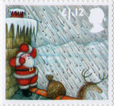
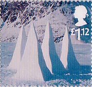
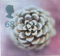
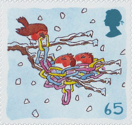
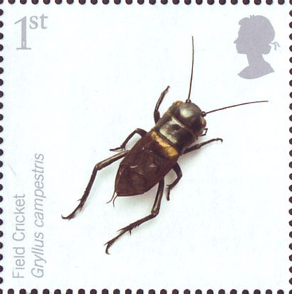
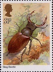
My main objection, though, or more embarrassment, concerns the designs of the 'pretty' issues. A picture takes up half the label. It's a flat colour background - an impression of the environment rather than photographic or in any sense realistic, which is fine and has a certain style. On top of that, though is a drawing or painting of some animal that is neither in the background style nor sufficiently realistic to contrast as it might. It may well be a good drawing, although I am not so sure about some of them, but it simply doesn't work as a design. Compared to some of the brilliant examples in the commemorative stamp issues, these come a very sad second, or even third!.


Oh well. One thing that has been worthwhile has been my search for the 1985 stamp image. Not collecting commemorative issues for many years now, I had not realised just how many I had missed. Some sets look fabulous but others also look dreadful. I shall revisit some of these, I think, and reproduce some of the best and worst here. It's not exactly 31p purple, I know but something I feel I should do. There are also some Castle Commemoratives that I am none too sure I had. Now those I may have to acquire, even though they were not, strictly speaking, definitive, or even casually speaking for that matter. They just look like a set I should have to go with the other actual Castle definitives.


August 03, 2013

2013 Code issues

That list is definitely required! I very nearly added funds to Messrs Norvic's coffers for the £2 and £1.28 MA13 code stamps which I thought I had missed. I had, in fact, got them but failed to update my catalogue.

Apologies - I must make more effort and do the ruddy thing myself. I just kinda hoped I could copy someone else's!

I still can't figure out whether these came from Tallents House though. I don't think they did but enquiries are in hand and I will update here soon.

What is still confusing me is the MA13 / M13L business. It would seem that all the DLR issues are appearing with the former format which I had thought was sort of not Royal Mail approved and would therefore have to be corrected. Looks like I was wrong there. I clearly need a whole day in the shade with a supply of coffee and a large horizontal, clean, dry and not windy, area to take a good hard look at what I have and where it should or shouldn't go.

August 02, 2013

78, 88, 1.88P DLR CHANGE. Well, not exactly.

You have every right to be confused by the 78p, 88p and £1.88 issues, with another set arriving from Tallents House this morning! Not to mention the strange use of P in RM's despatch note. (Unless, that is, I have missed something and there is a new 1.88p denomination!!)


The story so far: These new denominations were due on counters on 27 March 2013 but De La Rue happened to be moving away from Dunstable at the time and no-one can blame them for that. Walsall did the honours and ensured counters had the pink, yellow and blue supplies.

Philatelic Bureau customers will have received these at that time too and DLR also produced some coil strips with all the values which Tallents House staff guillotined for things like FDCs and some may even have slipped into singles orders! They will have clear cut borders.

Eventually DLR got going again and their counter sheets became available and these are now being distributed to Bureau customers (although some have been available since May!) They can be distinguished by the rouletted edges on the backing paper. Now, that may look the same as Walsall's could be in your mind but if you read my previous posts you would have realised that the Walsall stamps have the code M13L and the DLR have MA13.

The 78p referred to in my previous post will be one of the new DLRs - that supplier has yet to come up with the 88p and £1.88 or maybe has lost the will to look any further. I like all this - it is what makes collecting fun, interesting and one or other of these items may prove to be just scarce enough to make it all worthwhile for our children's children's children when they look through the collections in some distant future.

I am now waiting for the minor variations in these issues to appear! Apart from the NVIs, there seem precious few really good varieties nowadays.

You should also be aware that the 20p has appeared with the Code 13 in sheets too. Before long, I think we shall need a catalogue listing the Year and which definitives were issued in it rather than my ridiculously long and confusing lists which show the value and, if you search long enough, the Codes available. I may have to work on that. If anyone does have a ready-made list, however, and can save me the work, do send me the link. Credit will, of course be given!


August 01, 2013

More wild life - some you might even actually see

Here are the Pond Life 2 Post and Gos that you are more likely to see in the real world, with Type 2 typeface from the Wincor machines.

Some pretty butterflies add to the casual nature of this distribution with the familiar 4 x 1st Machins.

Just four items in this month's envelope. The 1st red is a Code 13C with pale head and bright fluor from the Football Heroes mixed booklet pane of 4. the 2nd blue is a scarce Code 11T with bright fluor from books of 12. Then we have the 2nd Large from counter sheets (you can see how quickly they're not selling!) with Code 13 at last and the De LaRue version of the 78p Code 13 MA13.

I am so glad that I cancelled my order for minor variations in iridescent overprints and phosphor bands! As you can see from the extracts from the stock list, just nine singles would have set me back £81 and some frightening prices for booklets would have meant my daughter's driving lessons would have have had to have been put off for another few weeks and I would have had to be the one gripping the passenger seat and stamping on invisible brakes.

I do seem to have missed, though, a darker shade for the Northern Ireland 87p linen definitive. That may be because I was concentrating on Machins in my original order so I had better correct that and will feature that as soon as it arrives. Now colour shade changes are something I do look forward to and don't mind paying for.