May 30, 2015

In the postman's bag this week

I was telling my postman about the 1d black anniversary issue last week and as he'd never heard of them I suggested we have a look through all the mail in his bag and see if there was one there. Not only were there no 1d black anniversary issues but there there were no Post And Gos, no special issues and just two actual stamps, a couple of 1st Class reds, one which look distinctly as though it was being reused when we looked a bit more closely, despite all the security slits and awkward glue.

That was amongst the whole of his round still to be completed, well over 200 items which we just skimmed through pretty rapidly so may have missed something but I doubt it. Horizon labels were the main 'stamp' items amongst the bundle.

I am beginning to wonder just what the numbers would look like for stamps sold for postal use. I know that collectors are probably providing 99% of the revenue for special issues but the thought that we may be the principal raison d'ĂȘtre for most definitives too is saddening. I can't stop until the Machins stop but I am, for the first time, almost hoping for their end.

Spare a thought too for the Post And go collectors who have not cancelled orders for the non-Machin issues and overprinted issues. I've counted 22 new issues, not counting those illustrated below, three for the Heraldic Beast issue but most of the others all new overprints or old overprints on different labels. There are even some from overseas exhibitions. They would have needed well over £500 to fund that lot in an attempt to stay 'complete'!


The Cartor versions of the 1st black and blue are not Machins I know but these are nice stamps that ought to be in any British collection, although I am none to sure of the need for these 'Smilers' sheets. the facility to have a photograph of yourself or someone or something else professionally printed and appearing on a sheet of proper British postage stamps was quite a remarkable thing when it first came on the scene. It pushed most of our computers' graphics cards to their limits to handle the process and it was a bit tedious over dial-up but it was different, if expensive. The 'Smiler' issues that were available for the process also seemed vaguely appropriate but now you can appear next to anyone.

Similarly, you'll find a variety of labels next to these stamps but I'm not too bothered, being only interested in the variations of the stamps themselves.


Next we have the Post And Gos in a 'normal' strip with the MA14 date code and font IIA. the previous ones are all short phosphor variations, not that you can see much difference here. I shall probably sell the short phosphor versions if anyone wants them.


Now here's something interesting! Sme post office staff have put the wrong roll in the machine again and we've got 2nd Class values being printed on the olive background. It wasn't that long ago that we had the 1st Class and higher values printed on blue so this sort of balances things nicely. I like this pair. Because it is comparatively easy to do, I suspect that values will never be vast because it is simple for someone to recreate if they're a little mischievously inclined.


The Great War 21015 prestige booklet carries just three new Machins. The 1p, 5p and £1.33 have the M15L MPIL security codes. The small definitive size poppy stamp is attractive. The Poppy series of remembrance issues are quite exceptional designs all of them and would make a superb collection on their own.


A 2nd Class from the Walsall book of twelve with the M15L MTIL code.


De La Rue have a M15L code for the counter sheet 1st Class and 1st and 2nd Large issues too. In addition, it seems that they didn't do enough M14L Special Delivery stamps as that has now appeared with M15L after years of inactivity beforehand.


The Walsall 2nd Class with M15L MTIL comes from the revised booklet with slightly different text as we get yet more lessons in distinguishing between normal and large. I find that putting almost anything in my thickish C5 envelopes will stop it slipping through the device the ladies at Towcester Post Office use. How ever many times they put stuff on booklet covers or issue posters, there is really no way most of us can figure out how thick 5mm is. I am not too sure I have much of clue as to how heavy 100g is either. I know from my younger days that jars of jam are 454g but that probably includes the glass.

May 06, 2015

175 years on, two nice new commemorative stamps


A marvellous job by Royal Mail for the 175th anniversary of the 1d black and 2d blue being made available for postal use to the public. Several items are being promoted but the main items are the self adhesive !st black in a book of 6 from Walsall and a miniature sheet with  1st blue and 1st black se tenant in a pane of four. This is a gummed sheet.


Both have the security ovals in the perforations and pretty gigantic phosphor bands. They all have the position letters SC which was presumably chosen by some committee at some point. It would have been fun being party to that discussion! Did they just pick letters at random? Did someone's little daughter dig letters out of a couple of hats? We may never know.

I would like to have seen the 2d Blue used as a 2nd class denomination. I know that that would reverse the order of the two but it just seems right somehow. Anyway, that isn't to be.

If you do need some stamps, ask for these at your Post Office as it would be nice to see these on as much mail as can be organised.


May 02, 2015

More 2015 codes

The new Comedy Greats introduce a variation in the related booklet. It seems that it is a tradition now to issue a 4+2 book with each Special Issue (assuming that they have a 1st Class NVI value) and pop two examples in with four 1st Class definitives of the day. I haven't checked when this started and whether it has, indeed, been consistently maintained but it certainly seems to be doing so now.

The variation here is that the larger space for the Special issues is fully occupied by an illustration within which there is the stamp with no border, just the perforation. Interesting. The Machin stamp is the M15L MCIL we've seen before.


A new book of 1st Large includes MA15 MFIL stamps.


A 2p M15L MAIL counter sheet stamp has appeared with a 5p and 20p joining the ranks of 15 codes.


Lastly for now, Post And Gos have gone completely mad with all sorts of overprints appearing on all sorts of different backgrounds. although my supplier did actually send me a bundle of Flags with The RMM, The FAAM and goodness knows whatever acronyms they'd done so in error and are already winging their way back in order to get a refund of the £50 plus cost. Whilst I am sure some of you love these acronym overprints and can happily afford to lay out the regular fortune required, they rather leave me cold. Had overprints been a very occasional thing I might have stuck with them, although I am not entirely sure how I would have coped with what must be the almost impossible task of having a 'complete' collection when you can never really know which Post Office might have some dusty old Birds II roll to put in in future or some strange printing appears when an engineer pops in and makes an adjustment.

All that remained on the Machin front, thankfully, are these pairs of Europe 100g and Worldwide 100g denominations. One pair has an MA13 in the background, the other MA14. You would, at least, have expected an MA15 but there you go. That says a lot. And you'd have though these Post And Gos would have been getting through the rolls but I am wondering just how popular they really are. I haven't yet been in a Post Office where there has been a machine installed. Presumably they do seriously impact on queues at the counters and allow us to pop in and get the required label pretty smartly. I just wonder, though, about just who pops into Post Offices now anyway? I do, once or twice a week, to post parcels which these things wouldn't help me with anyway, but I seldom have to wait very long. If the queue has stretched a bit far then I'll go and do something else and return later.


These are beginning to look very boring now. I am still having third and fourth thoughts about whether even to continue with the Machin labels. I suppose if the costs remain moderate I will but they're not inspiring me. The Horizon labels look just as interesting and seem far, far more widely utilised.

Soon we should have some visual treats with the Penny Black and Twopenny Blue issues. They do look very smart and I do hope there will be some interesting oddities in the mix. It would also be nice if people would actually use them in post. Perhaps the Post Office should try and supply just these for a week in recognition of the other Hill's efforts in 1840 and put all other first class labels aside.


May 01, 2015

Happy 175th Birthday 1d Black


Look out for some excellent new issues in a few days.


March 30, 2015

Better images for the 2015 definitive issues

Now I have the actual items I thought it wise to show them here as some of Royal Mail's illustrations suffered from more than a modest surfeit of green! First, the Regionals which I know are not Machins but I still collect them. It really is time the designs were refreshed, though. Why on Earth is there a different font used for each Nation? Weird.


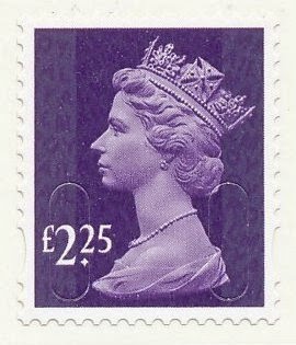
Next the new values: £1.33, £1.52, £2.25, £2.45, £3.15 and £3.30 in colours that I am sure we have seen before. £1.33 amber yellow looks pretty much like the 35p yellow-olive or 88p orange-yellow. £1.52 orchid mauve could be 78p deep mauve or £1.90 bright mauve. £2.25 plum purple is 31p's deep mauve and £2.45's spruce green looks pretty much like a holly green to me. The £3.15 in aqua green is a bit different but the £3.30 reminds me of a 39p bright magenta or was it rhododendron?


The new 15 codes are here again too. 1p, 2nd and £1 M15L MAIL and a 2nd M15L MBIL


Next is something new. A 'Europe' value 4og issue from long ago with the high set value in a pale milky blue. This is a hard-to-find shade.


The Post And Go dual value single label is new because it has phosphor bands that actually synchronise with the label dimensions rather than starting or stopping short! So not exactly an awe-inspiring addition to the collection. And in a period when there are overprints of some Postal Offices' names (e.g. Crewe) emerging as well as yet more variations of fonts on Birds or umpteen permutations of whatever the latest pictorial is and probably more overprints too, it is a relief that the only additional two I shall need are these delightfully chopped off prints of the "nd Class issues.


Lastly for now, there are the 15 codes now for the 1st and 1st Large Signed For issues. I send mail every week that needs to be signed for but all my Post Office people ever use are the gold Horizon labels. These illustrations are not in proportion, by the way! Not sure what happened with those scans.


These items will shortly appear in my catalogues.

March 10, 2015

2015 Definitives


You'll need £14 for the new British Machin definitives coming out on 24 March. This is an extraordinary set of values, not just because the combined cost is so much but just look at the denominations themselves. Nothing new, of course. I remember being amazed that anyone would have thought the public really needed a 20½p stamp and for a long time wondered whether there would ever be a 21p stamp to fill that missing gap in the run from 1p to 50p.

What was wrong with the concept of 1-2-5-10? You could make any value using a quite reasonable number of stamps. With a 20p and 50p, even an awkward looking 88p parcel would have only needed six stamps. Admittedly, we did all quite like the new values, especially when inflation produced new rates every few months, but we would probably have happily settled for something like 1-2-3-4-5-6-7-8-9-10 and then 20-30 etc and £1-£2 etc. That 88p would have only needed two stamps and even these weird new amounts could be covered with just three at most.

But, for those Post Office Counters where they employ people who didn't do addition at school and companies using very small envelopes, here we have some lovely new values. And for us collectors, of course, who, I suspect, may finish up owning the majority of the printed output.

These are being printed by De La Rue and will probably have the M15L MAIL code. I don't see any of these making it into booklets or anything requiring another printer or code but you never know.

If you have any funds left then you can spend another £9.32 on the 2015 Regional or Country definitive updates. Luckily for our bank balances, it is still only the two lower values that get new digits. These designs have been going for some considerable time now. The English oak looks considerably greener than it used to. I don't think it's the print or screen but is, indeed, a new colour. The Scottish tartan looks somewhat lighter than before too but the others are much as they were. A matter to be investigated when they arrive as it is difficult to judge much from photos.


It is nice to see a £1 Regional but I think it would have looked better as just £1 without the 00 bit. I am, however, not expecting to see many of any of these 14 new stamps on mail that either comes here directly or on envelopes friends save for me. The nice clean new ones will be filed away somewhere, added to the various lists I maintain and that'll be it for my £23.32. Let's hope that something happens to make one or more a bit scarce or interesting. Maybe it'll be decided that the £2.45 and £3.15 values are two similar in shade and one or both get reissued in another colour after just a few weeks. Or the £1 English Oak is regarded as too green at the time of an election so is promptly reprinted in Conservative blue.

The Country stamps are described as being printed by International Security printers which seems to be interpreted as Walsall by the catalogue people. One day they and Royal Mail should have a chat about that.

February 26, 2015

A few variations


No, the booklet isn't wrongly cut, just my scan not being up to normal standards! This is, though, quite an expensive little book as it features four 1st red with dull fluor and the iridescent coating is short at the top. The stamps are the Walsall M14L MCIL which have appeared before. I don't need this in my collection so will be selling it if anyone is interested.


These two strips of Machin Post And Gos look pretty similar. Indeed they look pretty similar to another strip with that feint IIA font released last year. So what's the difference. First, the strip originally released had short phosphor bands - quite common on these things it seems. One of the above has what I'd call 'normal' or properly synchronised bands.

The other also has the same short phosphor bands at the bottom as before but also have what is described as sometihng akin to AOP, a sort of phosphor wash, presumably where the equipment has allowed the additive to spread during production, and, as well as being clear under a UV lamp it has also affected the printing which is very weak in the affected area which starts about a third of the way across from the left. That strip is the left one shown above and the poor printing is quite obvious.

Both strips are undated.


Lastly in this less than enthralling group that arrived this morning, there is the 2nd Class Machin Post And Gos with 'normal' phosphor bands. the previous ones were interrupted at the bottom so looked a bit odd. These are MA14 dated as before.

Again, none of these variations particularly interest me so I will probably keep the 'normal' ones and sell the off beat stuff.

How I miss the days when there would be all sorts of interesting Machin definitives appearing each few weeks.


February 25, 2015

Back to that 81p


Well, if the many scrutineers at International Security Printers can miss it then so can I! The 81p in the British Inventiveness prestige booklet is sea green but it should have been holly green - the colour of the De La Rue self adhesive issued in March 2014. The sea green version dates back to 2008! So that is what all the fuss was about.

I am not sure it need make the stamp any more valuable, though, as it would have been a different item anyway, both as a new printer and with its security code.


February 24, 2015

Now an 81½p would have been more interesting...


A somewhat over-designed prestige booklet came out this week. Inventive Britain sort of excuses the enthusiastic design evident in the front and rear covers, celebrating as it does some remarkable achievements by inhabitants of our islands over the years.

Inside there is some good text and the set of 10 special issue stamps, with two of them duplicated to make the three panes of four add up. There's invention all right. More to the point, though, and the first stamp pane for a welcome change too, is the Machin pane in what has become a very fixed three by three affair with someone having to conjure up something suitable to go in the middle. Why we have to have a label in the middle when another stamp would be perfectly acceptable is beyond me.


Some commentators are promoting this as of equal importance to the Wedgwood £3 book and its ½p pale blue left band because there is just one 81p in this book and I suppose the 81p is vaguely similar in colour. It is, though, some 162 times higher in face value so may have a chance but with the ½p stamps currently going for about £10 in a complete pane a £10 price tag for the 81p isn't that difficult to envisage anyway.

There does appear to have been quite a bit of advance interest with Royal Mail apparently restricting orders of panes as dealers tried to stock up in a big way, expecting this to be something of a special item. I am not convinced, especially as no-one uses the stamps in prestige books these days. In the Wedgwood book days they did and there lies the difference. Even the design of the panes doesn't exactly encourage anyone to tear the stamps out, even on the special issue pages. The firm want you to but the book and put it away somewhere. If you need to post something the pop down to the post office and they'll put a Horizon label on it or just get some NVIs at the supermarket.

The book has four new Machins that we need: 

1p crimson 2B
2p deep green 2B
81p sea green 2B
97p mauve 2B

All have the M14L MPIL code and are printed by International Security Printers who, I think, get called Cartor still.