January 26, 2020

Even further beyond the pale.

I decided to take a closer look at what was in the box of labels I had collected and, as I had taken pictures of the different labels, I might as well share them here in case anyone is interested. I will add headings for what seem to be distinct groups but I won't bother with any other identification as that's pretty obvious. Apparent duplicates in groups will be for different years in which they were used and/or a Welsh version.

I do seem to recall that there are more types of security slits or cuts and also printing variations which may require some further adjustment of these when I get a chance to look up the differences and then publish them here so others may be able to distinguish between the less obvious gold label groups.

As and when I find some more informed and accepted 'groups' or terminology I'll update this post - so these are just my own basic findings.

Group 1

Perforation-style edge, Security cuts, DD-MM-YY date style


Group 2a

Different date display, DD/MM/YY, bold service font
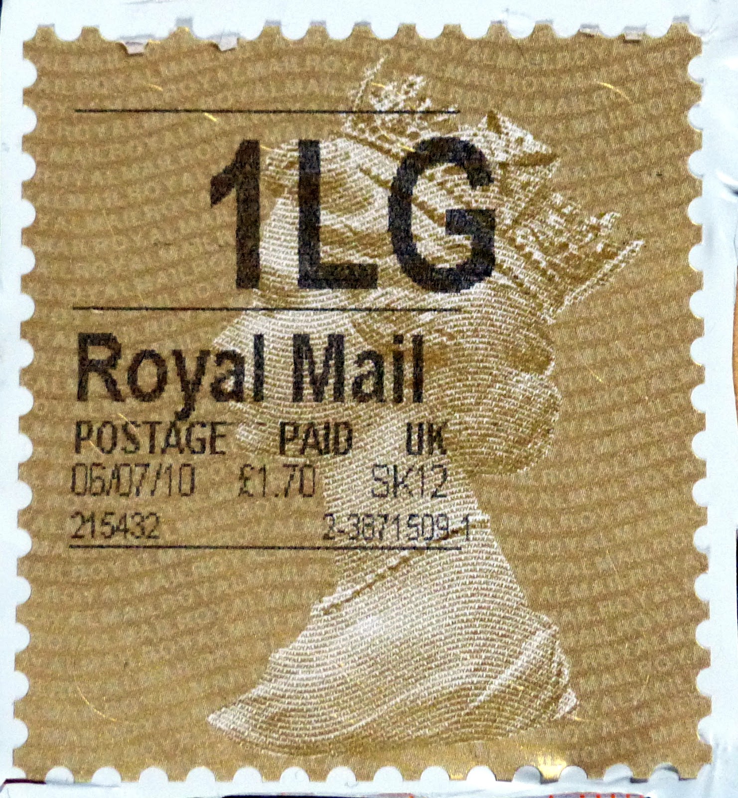


Group 2b

Similar to Group 2 but normal font weight
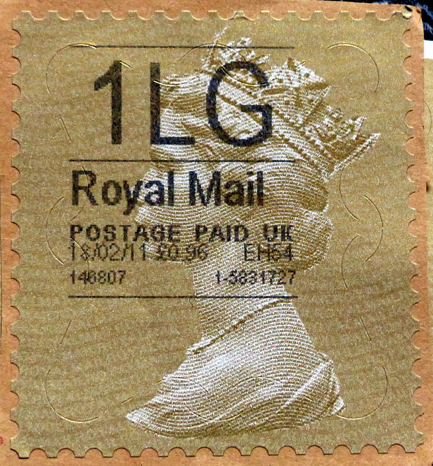


Group 3 

As Group 2 but with Royal Mail + dot code


Group 4

Straight edge, No Royal Mail dot code, DD-MM-YY date style


Group 5

Straight edge, No Royal Mail dot code, DD/MM/YY date style


Group 6

As Group 5 but now Royal Mail + dot code


Group 7

White paper, Group 6 style, security slits on right side only


Group 8

QR Code, 'Royal Mail' in title, security slits right side only.


Group 9

QR code, 'Royal Mail' omitted from title, security slits right side only


Group 10

Year code in background, re-arranged and new data, no security slits

From Self Service machines and with slightly smaller dimensions.


This is very much work in progress rather than a definitive guide, more to help me see what I have as it is much simpler to look at these images than sift through the real labels which, being attached to all kind of card or material, are not that easy to handle or file away. The security slits make most of these labels difficult to remove and then they are still sticky on the back or flimsy and prone to damage. So they'll be staying where they were and I'll have to think about storage and display.

Whilst I am only too well aware that many will wonder what on Earth drives me to collect and write about these I can only offer in my defence the fact that these are, at least, all 100% postally used items!! So much of the other new material coming in will never see the front of an envelope or a sorting office.

On that note, I have found in amongst the several hundred Horizon labels (if I can still call the nearly square things that) precisely six Post And Go labels, none of which had any picture or overprint either. I shall collect them - but solely used ones, so I don't expect I shall be needing a massive album for them just yet!

That can never, of course, be a complete collection so it will be something similar to what we used to have when we were young and had a few stamps from different countries. We knew then that we would be extremely unlikely to have all the stamps from any particular set and gradually we lost interest in most of the pages as we decided to specialise in an area where we might hope to have fewer gaps over the years. I'll stick 'em in, using an old 1970s pack of stamp hinges that I've still got. It'll be like old times.

As for these big and quite ugly labels, I feel there is some chance of attaining completeness insofar as types of print, security features and data presentation is concerned, once I can figure out what's missing. Then there is the task of finding the range of the different services. That's trickier as there do seem to be quite a few different 'service' names and abbreviations used even in just 10 years, some of which will be very hard to find. Unlike rare variations of Corgi Toys, however, I am hoping that these things will not yet have become very appealing to many people and I can acquire most at a modest outlay. I mean, seriously, who would want to charge me more than a few shillings for these?!


Beyond the pale.


Just for a change, a 'Horizon' label (if that is what they're still called). I am a bit out of touch with these but do find then interesting in a strange way. These things are everywhere now and seem to be almost the only way that my local Post Office has to affix any evidence of postage payment to an item.

None of the labels I have watched them affix there, however, look like this one, which also is quite different to any of the many that arrive on parcels here each week. (Readers of my other newsletter will understand).

This may be the lastest design, although the proximity of the postage price to Her Majesty's image is surprising. There also seems to be a lot of unnecessary underlining which tends to remind me of how teaching colleagues in the 1990s would use both bold and underlining to emphasise something but achieve the opposite effect of making it more difficult to read. At least Royal Mail software doesn't provide access to the Comic Sans font. We should be thankful for small mercies.

I used to keep the gold labels and have a box full of them and variations on the white theme but I didn't bother keeping what looked like unchanged designs over more recent times. I think I shall have to loo a bit more closely and dig out those old ones as they could make an interesting study.

Just as many of my colleagues thought I was mad to collect so many seemingly identical Machin stamps and nod or mumble sympathetically as I show them pages and pages of seemingly, indeed, identical little 1st Class red stamps, I have a feeling they will regard me now as quite beyond the pale.

Update: As you may see from the helpful advice in a Comment from Ian at Norvic, who knows a lot about these, I am way behind the times on these. Indeed I have two more labels which arrived in early 2017 and somehow didn't catch my attention. I see that, unlike the other labels which are affixed by the Post Office people, even, it seems the very latest, these from Self Service machines have a date code just below the back of the crown. So I have MA16 and MA17 and will remember now to look more closely at any others coming in.

January 22, 2020

The first M20L code, a change of printer and some poor design

The Philatelic Bureau have sent me these issues which arrived today. 


I am guessing that the 1st Signed For and 50p stamps have now been printed by Walsall and that is the reason. They both feature M19L codes too which makes them new in my book anyway!


The other item is the first M20L item - the 1st Royal Mail red MCIL from the Tomb Raiders' Concrete & Clay book.


I seldom pay much attention to these 4+2 books but recognise they're a good idea in getting the latest special stamps out there to most of the population who probably wouldn't see them otherwise. Designers normally make a reasonable job of them but this time they're a mess. The stamps feature one font in the inscription but the extended identifier for the book shows something completely different.

The stamps themselves sit uncomfortably in thick white borders interrupting a background illustration which I can only assume someone selected at at random or for most obscure reasons which may make sense in game terms but look awful. I don't know which is worse; the bluish background against the predominantly green and grey stamp or the sadly clashing shades of green grey and brown on the other panel. The stamps themselves illustrate two types of digital art, but they sit uncomfortably next to each other.

I usually only keep the books which have an example of a different Machin stamp so most of them get used for postage and I shall be quite happy for these to go the same way later this year. I do hope the 1st Class stamp doesn't turn out to be a one-off for some reason. 

December 19, 2019

More 19 Code issues with fluors and stuff. And Season's Greetings. 2020 will be better.

1p M19L MAIL dull fluor

1st M19L MCIL very deep Royal Mail red

1st M19L MAIL pale Royal Mail red, pale Queen's head, very bright fluor, weak iridescent overprint
(That's enough variations, Ed.)

2nd M19L MAIL bright blue, bright fluor

£1.17 sunrise red M19L MPIL Cartor

2nd bright blue, M19L MPIL Cartor

5p deep ash pink M19L MPIL Cartor

1st Large Royal Mail red M19L MBIL

2nd Large bright blue M19L MFIL

2nd Large bright blue M19L MBIL

2nd Large M19L MAIL bright blue very bright fluor

And that's it for 2019. 

Season's Greetings and let's hope for some excitement in 2020. You almost want inflation to return or Cartor to get sacked or something. 


October 30, 2019

More fluor, 19 codes and some shades

Lots of new stamps discovered by my supplier this month. The 5p M19L and 1st Large M19L MFIL are new and there is a distinctly paler shade of 10p. The others, though, I don't find exciting and I'm not too sure why I have them. They have either a different fluor which I cannot see or detect without special equipment and one or two may be printed on security backing paper which is upside down compared to a previous issue.

Where the backing card features a section of a booklet with text or an element of design then I guess that one can be confident that the stamp hasn't been peeled off and stuck back down the other way up! So I should retract some of my earlier comments about these being questionable items for a collection but I shall continue to refrain from cataloguing them or attempting to collect them myself.

Fortunately, the differences often coincide with a different shade or appearance, especially of the Queen's head so I am happy when that happens. Generally, though, these fluors are getting expensive and I may have to buy an ultra violet lamp of some sort so I can, at least, appreciate what I have. I may then even get some enthusiasm for them! As this little lot has set me back about £60 I could do with some.

I remember the excitement of the monthly arrivals of new Machins in the days when there were three or even four potential printers producing quite distinctly different stamps, coatings that were clearly and obviously a 'different' stamp to look out for and, probably due to the sheer numbers then printed for all of us actually using stamps, even within one printer's output there could be significant differences in shade. Whilst I do appreciate the dealers' efforts to spot and supply all these new 'differences' they really don't have the same appeal.

We are all getting older. I read recently that one long-term Machin dealer was ceasing to supply code changes after 19, telling us how difficult it can be to find the stamps these days as Royal Mail's philatelic people don't announce them nor appear to want to supply them either. Basically they'd had enough and had all kinds of other, probably more interesting, stuff to sort out and get sold before they are too ancient to spend the income.

I am hanging on in there as best I can, hoping that people buying Corgi Toys (my other hobby) will help me afford to keep paying the monthly bills and that I can continue to maintain my albums until this series does one day end. I can see myself closing the many albums after the last few additions and writing to cancel subscriptions. Finally I will know how much space I need for the 1p crimsons and the days of moving everything every few years will be done.

deep ash pink violet fluor M19L
light tan M19L
paler shade M19L
pale light green M19L
pale brown bright fluor M19L
pale orchid mauve dull fluor M19L

red dull fluor M19L MTIL
 
dull shade dull fluor M19L MCIL

pale red bright fluor M19L MAIL
red dull fluor M19L MBIL
pale red M19L MTIL

deep bright blue M19L MTIL

pale Queen's head dull fluor M19L MBIL

M19l MFIL
 
pale bright blue M19L MAIL

October 28, 2019

High Value 19 Codes


I say 'high value' but we have already had many Machins over £2 an £3 but you know what I mean.  These come direct from the Philatelic Bureau and I am assuming that the differences are the new code, the security printed backing and now they come from Walsall printers.