March 30, 2015

Better images for the 2015 definitive issues

Now I have the actual items I thought it wise to show them here as some of Royal Mail's illustrations suffered from more than a modest surfeit of green! First, the Regionals which I know are not Machins but I still collect them. It really is time the designs were refreshed, though. Why on Earth is there a different font used for each Nation? Weird.


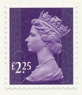
Next the new values: £1.33, £1.52, £2.25, £2.45, £3.15 and £3.30 in colours that I am sure we have seen before. £1.33 amber yellow looks pretty much like the 35p yellow-olive or 88p orange-yellow. £1.52 orchid mauve could be 78p deep mauve or £1.90 bright mauve. £2.25 plum purple is 31p's deep mauve and £2.45's spruce green looks pretty much like a holly green to me. The £3.15 in aqua green is a bit different but the £3.30 reminds me of a 39p bright magenta or was it rhododendron?


The new 15 codes are here again too. 1p, 2nd and £1 M15L MAIL and a 2nd M15L MBIL


Next is something new. A 'Europe' value 4og issue from long ago with the high set value in a pale milky blue. This is a hard-to-find shade.


The Post And Go dual value single label is new because it has phosphor bands that actually synchronise with the label dimensions rather than starting or stopping short! So not exactly an awe-inspiring addition to the collection. And in a period when there are overprints of some Postal Offices' names (e.g. Crewe) emerging as well as yet more variations of fonts on Birds or umpteen permutations of whatever the latest pictorial is and probably more overprints too, it is a relief that the only additional two I shall need are these delightfully chopped off prints of the "nd Class issues.


Lastly for now, there are the 15 codes now for the 1st and 1st Large Signed For issues. I send mail every week that needs to be signed for but all my Post Office people ever use are the gold Horizon labels. These illustrations are not in proportion, by the way! Not sure what happened with those scans.


These items will shortly appear in my catalogues.

March 10, 2015

2015 Definitives


You'll need £14 for the new British Machin definitives coming out on 24 March. This is an extraordinary set of values, not just because the combined cost is so much but just look at the denominations themselves. Nothing new, of course. I remember being amazed that anyone would have thought the public really needed a 20½p stamp and for a long time wondered whether there would ever be a 21p stamp to fill that missing gap in the run from 1p to 50p.

What was wrong with the concept of 1-2-5-10? You could make any value using a quite reasonable number of stamps. With a 20p and 50p, even an awkward looking 88p parcel would have only needed six stamps. Admittedly, we did all quite like the new values, especially when inflation produced new rates every few months, but we would probably have happily settled for something like 1-2-3-4-5-6-7-8-9-10 and then 20-30 etc and £1-£2 etc. That 88p would have only needed two stamps and even these weird new amounts could be covered with just three at most.

But, for those Post Office Counters where they employ people who didn't do addition at school and companies using very small envelopes, here we have some lovely new values. And for us collectors, of course, who, I suspect, may finish up owning the majority of the printed output.

These are being printed by De La Rue and will probably have the M15L MAIL code. I don't see any of these making it into booklets or anything requiring another printer or code but you never know.

If you have any funds left then you can spend another £9.32 on the 2015 Regional or Country definitive updates. Luckily for our bank balances, it is still only the two lower values that get new digits. These designs have been going for some considerable time now. The English oak looks considerably greener than it used to. I don't think it's the print or screen but is, indeed, a new colour. The Scottish tartan looks somewhat lighter than before too but the others are much as they were. A matter to be investigated when they arrive as it is difficult to judge much from photos.


It is nice to see a £1 Regional but I think it would have looked better as just £1 without the 00 bit. I am, however, not expecting to see many of any of these 14 new stamps on mail that either comes here directly or on envelopes friends save for me. The nice clean new ones will be filed away somewhere, added to the various lists I maintain and that'll be it for my £23.32. Let's hope that something happens to make one or more a bit scarce or interesting. Maybe it'll be decided that the £2.45 and £3.15 values are two similar in shade and one or both get reissued in another colour after just a few weeks. Or the £1 English Oak is regarded as too green at the time of an election so is promptly reprinted in Conservative blue.

The Country stamps are described as being printed by International Security printers which seems to be interpreted as Walsall by the catalogue people. One day they and Royal Mail should have a chat about that.