Showing posts with label prestige. Show all posts

May 25, 2022

First and last prestige book panes

I wondered out loud what might appear in Prestige books and here we have one. The Unsung Heroes Women Of World War II has what may be the face of panes to come.


Just five of the new style definitives with a slightly incongruous looking label. Now I am sure that the label is the same size as the stamps but it looks odd to me. Maybe the need for a label has gone, now that the pane is self-adhesive and not a sort of miniature sheet like we have had in the past.

The stamps are just two denominations, reducing the excitement still further - the 50p and £1 in what appears to be a pretty similar colour to the stamps we've seen already. Clearly, or maybe I should not say clearly as it is not at all clear without a QR code reader, the chunk of code on the right will distinguish these as issues from the Prestige Book but that would seem to be all.

Whereas the normal Machins of old had the MPIL part of the code after the year element M21L or whatever, these stamps have only M22L. MAIL appears to remain as MAIL across the stamps as far as I can see.

It is a little curious and could make used examples difficult to identify. Having said that, just how many used examples of these particular 50p and £1 stamps do we seriously think we will ever see? Apart from those that dealers post to themselves, my guess is zero. So let's not worry about that. 'Used Machins' is a subject for another day when I have a spare few hours to type and you have a spare few minutes to read.

I have not studied these in great depth and maybe we'll discover some difference in printing as I suspect that these come from Cartor and the others are from Walsall. I don't wish to offend the good folk at Cartor but, so far, I have found their end products rather lower in quality and impression than brothers Walsall and the masterful De La Rue, of whom we hear little nowadays. These seem rather better than previous ware - as I said, I cannot quickly detect a difference but I expect it will be a quality or finish matter that does distinguish these.

Presumably the last Machin pane in traditional style is, suitably, contained in the Platinum Jubilee Prestige book. This emerged in February but I forgot to write about it then.


Here we have some repeats in a 2p, 10p and 50p with M21L MPIL codes but a new £1.50 with this code. Indeed, this is the first time a £1.50 stamp has appeared in anything other than a sheet. It looks quite a bright issue to me and that might distinguish stamps from this pane from others if you encounter singles.


July 13, 2020

End of WWII, Queen and some definitives


 I am rather late returning to this news blog and I shall just publish what I have found lying around and it may be necessary to explain later, add more or delete duplications.


6 April saw the issue of this miniature sheet to celebrate the Declaration of Arbroath. Not Machins but I include the small definitives in my lists and these will all be new being inter alia on gummed paper as well as having [correction, I'd forgotten that these have not made it to self-adhesive world yet!] pretty much the same as sheet issues but with maybe small design differences I have yet to spot. There are sheets with and without a bar code.

£1.63, £1.68 and £2.42 definives with M20L codes have also appeared in my post box. I shall have to conduct an enquiry as to how these differ from the 17 March issues (if at all). I may have to remove these, just bear with me in the meantime as I am a little behind! [Update: these are March 2020 printings and seem to have a slightly deeper shade of Queen's head, although I suspect that there is a more significant difference between the results of my scanning these and the original issues.)


The 1st large Signed For now has an M20L code, first appearing around March - April.


From the End of The War book, issued 8 May we have three new Machins: 5p, 50p and £1.63 by Cartor, all on gummed paper and coded M20L MPIL.


Two more Concrete & Clay books with 1st in quite distinctly different shades of red. Quite how each compares to the 'normal' shade I have yet to investigate but one will match and another won't, for sure. These are all M20L MCIL of course and not necessarily new unless the shade of one or the other is of interest.


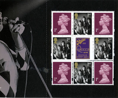
Another prestige book, issued 9 July, brings the band Queen to the attention of all those who collect prestige books. This will certainly make searches on Google more complicated than before. The definitive pane would be better referred to as the definitive size pane as it features the lowest ever combined value of Machins in all the history of prestige books. (I think that is true, although I am now wondering about the content of the Cookbook!) Expect a revision of this bit too in due course, with evidence.

What we have here are four 1p purples for no reason at all that I can think of, with four 1st class definitive size stamps with a photograph of the four band members as they were in the 1970s, all surrounding a strange label from one of the album covers.

I shall have to list all this stuff but I would really be quite happy not to see another prestige book. Whereas once I would have been writing to The Times and all and sundry to complain if a prestige book came out without a Machin pane, now I would welcome it. I would neither have to buy nor concern myself with what is a mere money-making item for Royal Mail and of practically no postal use. Yes, we can use the stamps but I have only admiration for those of you who collect just used stamps and who don't cheat by buying two books and sending the contents of one to yourself or good friends!

Not that that would stand that great a chance of a decent postmark anyway. These days it would be more likely to arrive either just as clean as it left you a few days before or with some heavy scrawl across it courtesy of your postman obeying one of many instructions to help prevent re-use of unmarked stamps.

Back in the 1970s my dear old friend Ugo Vincent could be seen making his way slowly from Abbots to Kings Langley in Hertfordshire where the good people behind the counter in Kings Langley Post Office would spend a great deal of time carefully placing round handstamps on the stack of envelopes he prepared for his stamp collecting friends. Yes, my used collection of late 1960s to late 1970s GB issues are very finely used indeed!


March 18, 2020

2020 New Definitive Values, James Bond and London 2020


The Queen Victoria 1d black, 2d blue and 1d red from 1840/1 return once more in a London 2020 booklet. You will recognise these from a few years ago when the 175th anniversaries were noted in 2105/6. I like the idea but the Queens head and value tablet placing has always jarred slightly with me. Having said that, I can't think of where else they could go. I might have been tempted to replace Victoria with Elizabeth II and change the text to 1ST CLASS and 2ND CLASS. In fact I might try that in my editing program and if it works I'll share the results here just for fun.

We also have a Concrete & Clay booklet and a Prestige booklet marking James Bond films.


The 4+2 booklet features  te 1st Royal Mail red with code M20L MCIL which we have already seen.

The prestige book pane has a strange combination of the Union Flag 1st and the Scottish Saltire 2nd so that's going to upset the Welsh and Northern Ireland people for a while. Then there are 2 very tired looking 2p deep greens and a couple of 2nd Class blues. the Scottish stamps have the later serif-style value tablet but the UK one is the older sans serif type, not that we've had the later type for that stamp. Now might have been a good time to change that although quite why we get this combination is anyone's guess.

This pane, being planned and presumably produced sometime previously, features stamps with the code M19L MPIL. The 2p looks very much like the one in the February 2019 book but the 2nd Class stamp looks, to me, a quite new 'baby blue' shade. It also appeared in the February 2019 book so I'll have to dig that out to compare. It'll probably turn out to be the same as Cartor would, I guess, just bring out the colours from last year in whatever process is used. Not a tube of paint, I know, but some sort of formula that can be readily repeated.

The main event this month is the issue of the new definitives, supposedly to meet demand for the new rates coming into force in a few days. This has become a regular March (or sometimes April) affair and I do look forward to it, albeit with some trepidation now that the combined total is £29.80!!


The official colour names are:
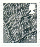
£1.42 garnet red
£1.63 sunset red
£1.68 tarragon green
£2.42 purple heather
£2.97 rose pink
£3.66 harvest gold
£3.82 holly green

I recognise a few of these.


The regionals are all just as we've seen for many years now with just new values. I can't remember seeing the black outline on the Northern Ireland higher value but that's probably my memory rather than anything new. Perhaps that was introduced when the font changed and I didn't notice.

Whilst these designs do reflect the nations well I am surprised they have not been changed since 1999. There are so many items or scenes which could be representing the four nations that could be used and I am also surprised that the designs have remained such that some values are not at all easy to read. I suspect that they are little used and no-one really cares. Those businesses who have sheets of them for particular product postage needs are so used to looking for the yellowy-brown or purple one that I guess staff don't need to bother about the value tablet either. One reason for retaining the designs, I guess.

Right, now to move once more rows of stamps from page t page to make room for all of these unexpected values. I really should have learned my lesson by now and left a lot more room between values.

March 15, 2019

Another Prestige Book. Marvellous.


As if the issues nowadays were not a joke already, here is another laugh for collectors as Royal Mail celebrate comics, the Marvel brand in particular. For fans of this genre I have no doubt that this will be a splendid affair but that really is it. The number of the prestige books that will be sold to anyone wanting to use the stamps is probably a really low number. I have long said that we should be collecting used examples of the contents. But that, I guess, is not a simple task and would necessitate either weeks spent going through charity sacks or doing what by old friend Mr Vincent would do; take the stamped envelopes along to Kings Langley Post Office and ask the chap behind the counter to do the honours. Carefully. He called it 'tipping'.

For this issue there is the Concrete & Clay book with four 1st red stamps with the usual MCIL code but these seem to be the first with M19L codes. These we should expect to see on envelopes from time to time.

The Machin pane in the prestige book, contains 1p, 20p, £1.25 and £1.45 values. I'm not sure how useful they'll be with the forthcoming rate change!


With their M18L and MPIL codes they will need to be collected if you are trying to keep up-to-date.

That's two prestige books in two months. At £12 or so a time, I may have to start using the other contents of the books myself!

There seem to be 33 different items at the Royal Mail shop for this issue. I am beginning to wonder just what proportion of their business is now funded by collectors as opposed to people wanting to post stuff.


August 17, 2016

No prestige Machins and Birthday book design errors


The 2016 Prestige Book finally arrived yesterday. Delayed from June due to an error in the Presentation Pack. I cannot quickly see why that meant we didn't get the prestige booklets but never mind.

As it happens it contains no Machins. That has got me wondering whether this is the first prestige book not to have any Machins? Something I shall have to consider.

The definitive pane has the very attractive small Poppy 1st Class stamp, the newer style English, Scottish and Welsh flags and the familiar Northern Ireland fields. Whilst the English and Scottish flags are quite well-represented, the Welsh dragon really does not seem to have coped as well with the rippling and perspective effect. You also do have to wonder why no effort seems to have been put in to come up with something other than fields for Northern Ireland! 

I have often suggested that scenes from around Britain could be a good future definitive theme and if flags presented problems for the Northern Ireland issue then they should think of something else that would be suitable for all four nations.

I shouldn't worry too much as few people other than collectors will see this particular production anyway. Whilst the booklet, as the preceding two have been, is very well written and illustrated indeed, my interest in the prestige booklets is rapidly diminishing now. That is not just the lack of Machins but for many years it has been mostly just one pane that I have wanted and the chances of any of these being used in a postal sense, always slim, have become almost negligible. When they were promoted in Post Offices and you could fairly easily tear off a few stamps for use on an envelope then it was worth checking your mail for that scarce used copy of a left or right band variant or one from a different printer perhaps. Nowadays you could spend a year and find none. Or probably even longer.

Because I feel that there may not be long to go before we finally see the conclusion of the Machin series I shall not stop now and, for the sake of completeness, I'll keep collecting the prestige books and hope that they don't get too expensive. (Of course, there have been the annoying 'Special Edition' prestige books but I am hoping that these continue not to have different printers or anything that might make the definitive content unique. Now that would be really annoying!

On the topic of booklets that have stamps we might see on mail, here are a couple that you can reasonably expect to be used as intended and not just bought and filed away. The Concrete & Clay booklets have been with us for a while now and work well, 


The second book, ostensibly celebrating H M The Queen's birthday a second time, has four O16R REIGC amethyst 1st Class as has the other Concrete & Clay book with some nice landscapes.

The birthday book is a little strange, though. A sort of half-hearted effort has been made, by the seems of it, to mount the two photographs on some wall, presumably in Buckingham Palace but all that results is quite a confusing jumble of lines that stop and start. It really does not work and is not the sort of design that I would have expected to have survived through to print. 

It was the same with the first birthday book of 4+2 but I didn't notice at the time. They have taken the four stamps from the 90th Birthday prestige book and included them in these panes. Unfortunately, the prestige sheet was one large image and so various bits of background were included in individual photos selected as stamps. In the Concrete & Cay books, however, someone has attempted to put a background  in which simple doesn't work. For most issues they leave the background plain or presented in a way that enhances and does not interfere with the stamps. Notably, for Morecombe & Wise a while ago they were able to extend the photos really successfully, presumably by working with some original stamp design artwork. Someone should have had words with the designers on this occasion. Bit late now.


The landscape issue is pretty enough and a more suitable background is used.

All the Machins have the now standard 'security backing paper'.

December 18, 2015

79p for a label


There is a reason for reminding readers of splendid past issues like these. But first, what's new?


To end 2015 there have been a few slight changes in the most frequently used definitives but nothing very exciting I'm afraid. It's a dull fluor on both De La Rue and Walsall stamps issued in recent months. 

There is also a Business Sheet 1st Large coded MA15 MBIL.

And, oh yes, some Star Wars stamps. You can hardly have missed the mass invasion of philatelic journals by celebration of the film series and Britain's contribution to its success. With the very latest movie released this week Royal Mail must surely have received a sizeable contribution to the old coffers from LucasFilm Inc. for the remarkable additional promotion it has provided.

In amongst the many, many special issue stamps we've seen in both this and an earlier issue is a Prestige Booklet with the traditional definitive pane of eight plus a label. This brings us a Union Jack 1st for the first time in gummed style. The 1st and 2nd Machins are also new, being coded M15L MPIL. 


You will have to fork out a massive £16.99 for this. For that you do get 24 1st Class stamps, 2 2nd Class and that's £16.20 at present rates, making the Star Wars icon label 79p. So if you do decide in years to come that prestige books are pretty but pretty unnecessary in your collection and it is just the Machin pane you need there is a good chance that'll get your money's worth when rates increase in future years. That's the way I look at the prestige books these days. Occasionally there is something a little special but most of them seem little more than income streams for Royal Mail. I have yet to encounter anyone who has bought one in order to use the stamps. Indeed, I have yet to encounter anyone who has bought one in the last ten or twenty years who has not been a collector!

We should be thankful for small mercies, I suppose. Those who didn't join us in abandoning Post And Gos last year will have the most ridiculous job trying to keep up. Not only have the various military associations decided to have an intelligible name on the overprint instead of a set of letters, involving a mass of reissued strips but there have been new designs, added overprint logos and more from the Channel islands to boot. Here's the list of 36 strips you've missed in the last two months:

Union Flag Royal Navy Trafalgar Day
Union Flag Royal Marines Trafalgar Day
Poppy Royal Navy Submarine
Winter Greenery NCR Strip
Winter Greenery Series 2 Strip
Winter Greenery Wincor Strip
Poppy NCR with 15 date code
Poppy Fleet Air Arm
Poppy Royal Marines
Poppy RN Submarine
Winter Fur & Feathers Presentation Pack version
Winter Fur & Feathers  NCR strips
Poppy Series 2 15 date code
Winter Greenery strip with old Euro 20g value
Union Flag Royal Navy
Union Flag Royal Marines
Poppy Series 2 15 date BPMA
Union Flag Hong Kong November 2015
Sea Travel Hong Kong design strip
Union Flag Sindelfingen October 2015
Machin no date Sindelfingen October 2015
Poppy 15 date Sindelfingen October 2015
Heraldic Beasts Sindelfingen October 2015
Jersey Flag Sindelfingen October 2015
Jersey protected Species Sindelfingen October 2015
Union Flag Paris November 2015
Machin Paris November 2015
Poppy Paris November 2015
Heraldic Beasts Paris November 2015
Machin Royal Navy + Logo
Machin Royal Marines + Logo
Machin RN Submarine + Logo
Machin Fleet Air Arm + Logo
Jersey Flag Broad Street RAFA Jersey 90
Jersey Protected Species Broad Street RAFA Jersey 90
Guernsey Flag Envoy House Merry Christmas

What you might have had to lay out to stay vaguely complete might have been better spent going back and filling some spaces in old pages. That ½p left band, perhaps, or the scarcer 17p Northern Ireland type. You could even afford the rare 31p purple type! Or how about getting a nice Royal Wedding £1 or PUC £1?

Whenever I post anything these days my Post Office use, almost without exception, the 'Horizon' labels. These are the ones that used to be gold but are now more white. I do think these are quite collectable but, of course, you can only obtain these 'used' on items so they're not something dealers are supplying much at the moment. It is quite feasible to send things to yourself to get many of the various types of label and I am sure some enterprising dealers will be offering a service to supply these in due course but I don't think there is yet a great deal of demand to make it worthwhile. I do feel, though, that collecting these makes more sense than collecting mint strips of Post And Gos.


June 18, 2015

Spend £14.47. File it away. Probably for another 200 years.


Another bleak prestige book of war came out today. This one is all about the Battle of Waterloo which is not the crowds at a London station but a place in what used to be called the United Kingdom of the Netherlands and is now in Belgium.

I have never understood quite why it is remembered and talked about so often now but blame Abba in the main.

Anyway, it represented an excuse for another expensive little book of stamps with ten special issues from the two sets being issued for this event as well as the part that we're really interested in, the decimal pane.

In the now traditional format of 3 x 3 there are eight Machins around some label. The labels I tend to regard as something of an also-ran in these things but I would draw your attention to this one being printed with a background that goes right up to the perforations, so would appear without a white border if it were ever to be seen on its own. Bearing in mind just how precise the alignment has to be to achieve that, I can't quite see the point but there you go. From some viewpoints, it looks as if the eight stamps border an empty space through which we just happen to catch sight of part of Trafalgar Square.

The new Machins are nice, sensible values: 5p in ash pink, 10p tan, 50p slate and £1 wood brown. Two of each. Although you know and I know that there's little chance of any of these being used on anything like normal postal items, at least we don't have to add a fifth 97p or another £1.52 to our lists. there are so many varieties of the main values that an extra one each doesn't matter a great deal.

They all have the M15L MPIL security code and two phosphor bars, printed on gummed paper by, presumably Cartor, if that is who 'International Security Printers' implies rather than some random international security printer.

This is £14.47 which you will spend, put away somewhere and probably forget about for another 200 years.


July 28, 2014

The Great War 1914 Prestige Booklet


Something for everyone with the 1914 First World War prestige booklet out today. The content is naturally sombre and factual, with an effective fold old illustration across a set of pages. As well as three new Machins, there are the four nation's 1st Class stamps in what I am presuming will be a distinguishable form.


The Machins are maybe not very 'new' as each of the 10p tan, 20p green and £1 pale brown (or wood brown as they call it) with the code M14L MPIL, printed by Enschedé could be found in the Buckingham Palace book. I am wondering if they do have any differences at all!

The Regionals are definitely new, though, as recent issues have been different designs so you'll need that pane anyway. I am not sure whether Cartor are any different to Enschedé now.


February 26, 2014

Prestige confusion and more Spring flowers than you may think


After all the effort I made to try and figure out who International Security Printers were it seems that the Loco prestige booklet was printed by Enschedé. Now, they may also be part of the magic ISP group but until I know more please accept my apologies for any rubbing out you now have to do in your records. So these are all new - four Regional pictorials and the 2p and 5p. You'll recall that the 5p Enschedé in the Merchant Navy book had ellipses near the top. And the last 2p was Cartor.


Another new find - no not a dark blue or black 2nd, that's just my scanner misbehaving and I'll replace the picture when I next use it - is a 2nd blue code M12L MRIL from Walsall. This came only in the coil issues used by big firms. Rare mint but you may encounter some used copies in used mail. 

A new set of Post And Gos is here. Using the same quite bland style of image but the subject matter does cheer in contrast, you need to look out for three different versions already! The first will be the usual strip sent out by the Philatelic Bureau, never to be seen again once installed in an album or box. They have font style 3 as before.

Then you need the nice new font style 4 shown above. These are from new Hytech machines - well, new software in old machines - and have a much more attractive and well-positioned text element.

Lastly, the usual Wincor mchine is printing them with font style 2, annoyingly still misaligned but at least easily identifiable!