November 28, 2020

Star Trek and a few more 20 codes


From mid-late November 2020, a few items I missed and now catch up with:


The prestige booklet celebrating Star Trek featured 2nd Class brt blue, 2p dark green and 50p greenish grey slate by Cartor, all M20L MPIL


1st dull Royal mail red M20L MBIL dull fluor


1st dull Royal Mail red M20L MCIL pale Queen's head

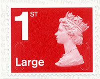
1st large bright Royal Mail red M20L MBIL

1st Large Royal Mail red M20L MFIL

2nd Large deep bright blue M20L MAIL


November 04, 2020

More 20 codes


1st Large Royal Mail red M20L MBIL
I am not sure why this is different to the stamp featured in the last article. Maybe the backing paper has the text reversed, which I don't list separately, and it has come by mistake.


The £2.42 value now has the very bright fluor that has been appearing a lot recently and is very noticeable with a UV torch but not without so if this doesn't concern you that's probably another you needn't buy.


You will need this one, finally getting its M20L MAIL code.


And this, the first appearance of M20L MSIL


And this, the first appearance of M20L MBIL


October 20, 2020

More 20 Codes and shades


Quite an expensive month with the issue of M20L code for the current top values in the shape of Special Delivery stamps for the <100g and <500g rates, the latter now getting a paler Queen's head and brighter fluor than an earlier issue. To be honest, the difference seems very minimal to me


Going back to 2019, here is an M19L edition of the 5p but in a deeper red shade of brownish-pink. again you may have trouble seeing much of a difference but the illustration at the foot of this post may help a little.


And then we have a few more 20 codes. The 1st Large Signed For is supposed to be a paler shade of flame red than last time. Once more, I am having a lot of trouble seeing these shade differences. It looks the same as the last one to me.


The next three are new 20 codes with no obvious further differences, although my new 99p UV torch does show how bright the backing paper is for the 2nd Class stamp!


Below are the new 5p (left) in the reddish shade and the previous browner shade.


September 02, 2020

More 20 codes and some thin paper

 Here we have a few more 20 year codes and a couple of variations for the 1st Class red shade and its thinning backing paper.


M20L MTIL Much thinner backing paper

M20L MCIL Deeper red Queen's head from Sherlock book, also thin backing paper with very bright fluorescence

2p Dark Green with M20L MAIL

20p Bright green with M20L MAIL

M20L MBIL very bright fluor with a yellow tint


July 18, 2020

More 20 Codes and a Challenge.

Here's a challenge. Find a Special Delivery stamp in the Royal Mail online shop. I failed. Anyway, here is my own 500g example with the latest M20L code. This ranks as the #1 high value stamp currently available with what I think is a £7.50 value at the time of writing. The service is more expensive if you need more insurance cover and I wonder whether the same stamp gets used in such an instance, in which case it would have an even higher value! Or, now I think about it, maybe if used for the Guaranteed by 9am service, it would be the highest ever, easily exceeding the old £10 definitive.


Next, there are some more 20 codes. I don't seem to have noted the arrival of the 1st and 2nd Class stamps or their Large siblings as M20L MAIL in previous posts. There is also now a 2nd M20L MBIL which I seem to have missed. So here they are now, together with a 10p light tan.


The only other item of interest is a 1st Class from a recent Concrete & Clay book (4+2) which has a quite different and thinner backing which is also very bright when viewed under UV compared to others. It may have appeared before but this is from the Queen edition and is the first I've noticed.


Apologies for the poor quality images in this post. Having already put the stamps away neatly in my albums I was reluctant to undo all my work and risk not being able to remember what should go where so I just used my mobile phone and did not wait for it to focus on some occasions. But you've all seen plenty of 10p stamps and the different codes don't even show on most of them anyway. I should have used old images and no-one would have noticed.


July 13, 2020

End of WWII, Queen and some definitives


 I am rather late returning to this news blog and I shall just publish what I have found lying around and it may be necessary to explain later, add more or delete duplications.


6 April saw the issue of this miniature sheet to celebrate the Declaration of Arbroath. Not Machins but I include the small definitives in my lists and these will all be new being inter alia on gummed paper as well as having [correction, I'd forgotten that these have not made it to self-adhesive world yet!] pretty much the same as sheet issues but with maybe small design differences I have yet to spot. There are sheets with and without a bar code.

£1.63, £1.68 and £2.42 definives with M20L codes have also appeared in my post box. I shall have to conduct an enquiry as to how these differ from the 17 March issues (if at all). I may have to remove these, just bear with me in the meantime as I am a little behind! [Update: these are March 2020 printings and seem to have a slightly deeper shade of Queen's head, although I suspect that there is a more significant difference between the results of my scanning these and the original issues.)


The 1st large Signed For now has an M20L code, first appearing around March - April.


From the End of The War book, issued 8 May we have three new Machins: 5p, 50p and £1.63 by Cartor, all on gummed paper and coded M20L MPIL.


Two more Concrete & Clay books with 1st in quite distinctly different shades of red. Quite how each compares to the 'normal' shade I have yet to investigate but one will match and another won't, for sure. These are all M20L MCIL of course and not necessarily new unless the shade of one or the other is of interest.


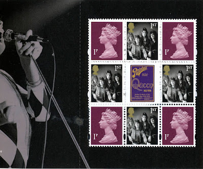
Another prestige book, issued 9 July, brings the band Queen to the attention of all those who collect prestige books. This will certainly make searches on Google more complicated than before. The definitive pane would be better referred to as the definitive size pane as it features the lowest ever combined value of Machins in all the history of prestige books. (I think that is true, although I am now wondering about the content of the Cookbook!) Expect a revision of this bit too in due course, with evidence.

What we have here are four 1p purples for no reason at all that I can think of, with four 1st class definitive size stamps with a photograph of the four band members as they were in the 1970s, all surrounding a strange label from one of the album covers.

I shall have to list all this stuff but I would really be quite happy not to see another prestige book. Whereas once I would have been writing to The Times and all and sundry to complain if a prestige book came out without a Machin pane, now I would welcome it. I would neither have to buy nor concern myself with what is a mere money-making item for Royal Mail and of practically no postal use. Yes, we can use the stamps but I have only admiration for those of you who collect just used stamps and who don't cheat by buying two books and sending the contents of one to yourself or good friends!

Not that that would stand that great a chance of a decent postmark anyway. These days it would be more likely to arrive either just as clean as it left you a few days before or with some heavy scrawl across it courtesy of your postman obeying one of many instructions to help prevent re-use of unmarked stamps.

Back in the 1970s my dear old friend Ugo Vincent could be seen making his way slowly from Abbots to Kings Langley in Hertfordshire where the good people behind the counter in Kings Langley Post Office would spend a great deal of time carefully placing round handstamps on the stack of envelopes he prepared for his stamp collecting friends. Yes, my used collection of late 1960s to late 1970s GB issues are very finely used indeed!


March 18, 2020

UK Postage rates over the years


I have updated the charts I last published in 2017 as we approach the latest increase in UK postage rates. 1st Class rates will start at 76p and 2nd Class 65p from 23 March. You'll see just how good an investment NVI stamps have been, especially those bought in 2006 or thereabouts!

Acknowledgements to http://www.wolfbane.com/rpi.htm for the RPI data. The UK rates I have recorded myself for many years.

2020 New Definitive Values, James Bond and London 2020


The Queen Victoria 1d black, 2d blue and 1d red from 1840/1 return once more in a London 2020 booklet. You will recognise these from a few years ago when the 175th anniversaries were noted in 2105/6. I like the idea but the Queens head and value tablet placing has always jarred slightly with me. Having said that, I can't think of where else they could go. I might have been tempted to replace Victoria with Elizabeth II and change the text to 1ST CLASS and 2ND CLASS. In fact I might try that in my editing program and if it works I'll share the results here just for fun.

We also have a Concrete & Clay booklet and a Prestige booklet marking James Bond films.


The 4+2 booklet features  te 1st Royal Mail red with code M20L MCIL which we have already seen.

The prestige book pane has a strange combination of the Union Flag 1st and the Scottish Saltire 2nd so that's going to upset the Welsh and Northern Ireland people for a while. Then there are 2 very tired looking 2p deep greens and a couple of 2nd Class blues. the Scottish stamps have the later serif-style value tablet but the UK one is the older sans serif type, not that we've had the later type for that stamp. Now might have been a good time to change that although quite why we get this combination is anyone's guess.

This pane, being planned and presumably produced sometime previously, features stamps with the code M19L MPIL. The 2p looks very much like the one in the February 2019 book but the 2nd Class stamp looks, to me, a quite new 'baby blue' shade. It also appeared in the February 2019 book so I'll have to dig that out to compare. It'll probably turn out to be the same as Cartor would, I guess, just bring out the colours from last year in whatever process is used. Not a tube of paint, I know, but some sort of formula that can be readily repeated.

The main event this month is the issue of the new definitives, supposedly to meet demand for the new rates coming into force in a few days. This has become a regular March (or sometimes April) affair and I do look forward to it, albeit with some trepidation now that the combined total is £29.80!!


The official colour names are:
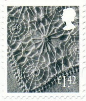
£1.42 garnet red
£1.63 sunset red
£1.68 tarragon green
£2.42 purple heather
£2.97 rose pink
£3.66 harvest gold
£3.82 holly green

I recognise a few of these.


The regionals are all just as we've seen for many years now with just new values. I can't remember seeing the black outline on the Northern Ireland higher value but that's probably my memory rather than anything new. Perhaps that was introduced when the font changed and I didn't notice.

Whilst these designs do reflect the nations well I am surprised they have not been changed since 1999. There are so many items or scenes which could be representing the four nations that could be used and I am also surprised that the designs have remained such that some values are not at all easy to read. I suspect that they are little used and no-one really cares. Those businesses who have sheets of them for particular product postage needs are so used to looking for the yellowy-brown or purple one that I guess staff don't need to bother about the value tablet either. One reason for retaining the designs, I guess.

Right, now to move once more rows of stamps from page t page to make room for all of these unexpected values. I really should have learned my lesson by now and left a lot more room between values.