Post And Gos continue to multiply. Now we have the definitive set with the new Type 4 font and these appear, annoyingly, on background designs both with and without the date code MA13. You'd have thought they would at least have made that MA14.
Furthermore and further requiring credit card action are two more overprints. Stampex 2014 and The BPMA continue to get publicity from these issues. They, too, will appear in two versions, dated and undated backgrounds. Strangely, I took the decision not to collect the overprints but still get them on my standard order with my dealer but I don't get the Flags changes. Something odd there which I'll have to attend to. The Flags are a sort of alternative definitive that crops up from time to time when no-one is too sure what roll to put into machines. It really does seem to have a pretty random appearance profile which is why I would actually like to have them and will just put the overprints up for sale.
Flags will be appearing when I get them. For now you need to look out for them with the new Type 4 font with and without MA13, and in Type 3a font a BPMA Postage Due 1914 overprint again ith and without MA13. (I am presuming it'll be MA13).
As if that were not enough additions to my catalogue list, a batch of 1st Class Stampex 2014 normal definitives were issued with the value inscription 1st Class Large instead of the usual 1st Class. I wasn't lucky enough to get these overprints by mistake, just the corrected ones. Odd that.
Back to fairly normal Machins the 1st Large and 2nd Large stamps from Walsall now have Type 2 slits - there is a clear break top and bottom - so are new stamps. They have MA13 and MBIL in the overprint, being from Business Sheets. Now, it may just be me or the light here but they also seem to have a very bright and clear iridescent overprints. I am sure a new process is being used for that.


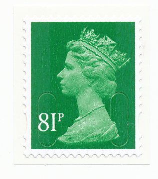
A recent, not very much published change in postage rates has brought along the usual Spring new definitives. There are four new additions to the amazingly still growing list of Machin denominations. Wonderfully bizarre values: 81p, 97p, £1.47 and £2.15. The £1.47 appears to have been left in someone's pocket during a wash cycle but that really is the true colour and not my scanner playing up. I suppose the postmarks will be clear but I would be quite disappointed if I have handed over £1.47 and had that in return. The surface of the 81p, in particular, looks quite scratchy when compared to older issues. All except the £1.47 have blemishes I am not used to noticing. It will be interesting to see whether this is something that all Machins just have and is neither here nor there or whether it is a significant quality matter that gets addressed and, of course, either the replacements of the originals then become collectable in a big way.


The Regional issues get in on the act too with each issuing a 97p value. In what must be one of the longer running designs now I think about it, the Northern Ireland lace, Welsh blue (why blue anyone?) daffodil, Scottish thistle and English oak now have nines and sevens inscribed where one were just eights and, in 2001, just the letter E.


