August 11, 2022

New Regionals with codes


Here are the new Regionals, following the changes made for definitives and NVIs. I am quite surprised that the opportunity was not taken to bring in some fresh designs for these four nations. They were pleasantly different and original way back in 1999 but whilst some still work well others have not stood the test of time so well.

The Northern Ireland 1st Class has never seemed right, stretching the Emerald Isle idea to the limit with some fields which I would not be at all surprised to discover were a graphic designer's choice from generic stock photos and may well be an aerial view not far from me here in sunny Northamptonshire!

For what is now the top value we have an oak tree, a thistle, a leek and some embroidery instead of a potato or whatever we should associate with Northern Ireland. Had I been on the committee at the time I am sure I would have voted against the decidedly grimy looking leek as being rather sad for the Welsh and the NI stamp on the grounds that the value tablet is invariably most unclear. Adopting four plants, a rose, a thistle, a daffodil and a shamrock (?), or some variations on the theme, would surely have been more attractive and consistent.

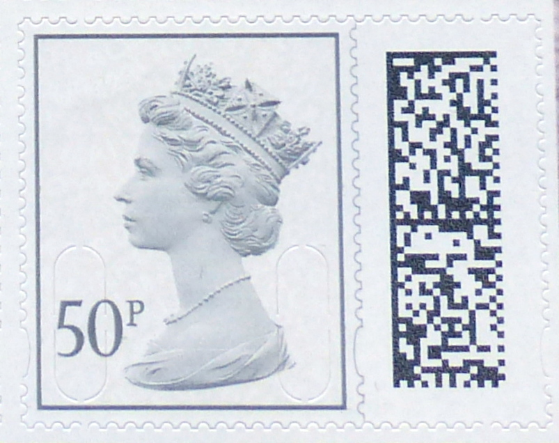
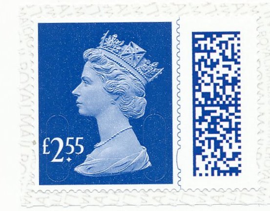
I shall stop moaning now and let you enjoy these new issues with their false perforation lines and codes. You can also have fun trying to figure out where in the main image you can find the code section colour used! Just for fun I have removed that perforation line from the English 2nd Class and I am not sure it isn't actually a better looking stamp. With the gap now evident closed a little that would, in my opinion, be an improvement. That line strikes me as a failure of design. You really should not have to draw perforation lines and the ellipses jar rather.


May 25, 2022

White spots before your eyes. Distinguishing the new 50p and £1.


You will see straightaway that the QR codes on the Prestige book stamps are quite different from the sheets issues. For a moment, I thought this would enable us to distinguish one from the other. But no, of course, as each individual stamp will have a different QR code and that will not help after all!

I suppose it is feasible that part of the design might remain constant to reflect the common source but I would need someone to advise me on that one. There will be something in the long string of characters that will be produced but identifying that amongst the mass of white squares is not something I am going to attempt without guidance!

The slight difference in size of the issues here is purely down to my inconsistent cropping of the later images. Apologies. The colour difference should also be ignored.


Update 16 June 2022

I am grateful to Lew Paterson for looking at the QR codes for these (and some other) issues. Here are his findings.

The 4 codes for these illustrations are:

JGB S19981017031001847760010025012201 F6B51D5D00FE2D5801

JGB S19941017031004573840010012012201 7A2413CCC098BDEB01

JGB S19981017031000997760005024012201 53FAA4B2899ACD6801

JGB S19941017031005321590005011012201 D1E0328AE6EDE24501


Possibly the first of each pair, has S1998 while the second has S1994 - could these be different source codes? Yep, just tried my own - S1998 is the Prestige sheet while S1994 is the counter sheets

Looking further, the counter, Book of 8, book of 4 and business stamps use S11 for normal stamps and S12 for large stamps with the last 2 digits in the 20s for 2nd class and in the 10s for 1st class.

First and last prestige book panes

I wondered out loud what might appear in Prestige books and here we have one. The Unsung Heroes Women Of World War II has what may be the face of panes to come.


Just five of the new style definitives with a slightly incongruous looking label. Now I am sure that the label is the same size as the stamps but it looks odd to me. Maybe the need for a label has gone, now that the pane is self-adhesive and not a sort of miniature sheet like we have had in the past.

The stamps are just two denominations, reducing the excitement still further - the 50p and £1 in what appears to be a pretty similar colour to the stamps we've seen already. Clearly, or maybe I should not say clearly as it is not at all clear without a QR code reader, the chunk of code on the right will distinguish these as issues from the Prestige Book but that would seem to be all.

Whereas the normal Machins of old had the MPIL part of the code after the year element M21L or whatever, these stamps have only M22L. MAIL appears to remain as MAIL across the stamps as far as I can see.

It is a little curious and could make used examples difficult to identify. Having said that, just how many used examples of these particular 50p and £1 stamps do we seriously think we will ever see? Apart from those that dealers post to themselves, my guess is zero. So let's not worry about that. 'Used Machins' is a subject for another day when I have a spare few hours to type and you have a spare few minutes to read.

I have not studied these in great depth and maybe we'll discover some difference in printing as I suspect that these come from Cartor and the others are from Walsall. I don't wish to offend the good folk at Cartor but, so far, I have found their end products rather lower in quality and impression than brothers Walsall and the masterful De La Rue, of whom we hear little nowadays. These seem rather better than previous ware - as I said, I cannot quickly detect a difference but I expect it will be a quality or finish matter that does distinguish these.

Presumably the last Machin pane in traditional style is, suitably, contained in the Platinum Jubilee Prestige book. This emerged in February but I forgot to write about it then.


Here we have some repeats in a 2p, 10p and 50p with M21L MPIL codes but a new £1.50 with this code. Indeed, this is the first time a £1.50 stamp has appeared in anything other than a sheet. It looks quite a bright issue to me and that might distinguish stamps from this pane from others if you encounter singles.


April 04, 2022

The new definitives


Following the release of 1st and 2nd stamps in the new larger size with barcodes, April sees 14 new stamps with specific values. These come in two styles  - similar to the 1st and 2nd Class stamps, the four new standard rates for various services have a strong-coloured background. The second type is an interesting development, with a white background and the inks just applied to a rectangle border for the stamp and the head and value tablet and barcode, of course.

These are reminiscent of the 2000 issue. Values follow the sensible 1-2-5 principle with a £3 intruder. These are attractive and, with less ink splashing around perhaps they will be even less likely to have mistakes. I'll be looking out for breaks in the border where a pixel or two might be more noticeable than it would have been on a full colour background.

It remains to be seen whether future denominations, and the NVIs, will stay with full colour backgrounds or follow the new series. Whilst these are still Machins, it is a new section in the Machin collection and a welcome opportunity to take a breather and finally re-arrange those that have gone before! I wonder what prestige books will contain? If they also follow the new styles then I need not worry any more about how much space to leave between £1 and £2 denominations!