Showing posts with label Post and Go. Show all posts

August 24, 2016

I prefer collecting items not intended to be collected


Now here's something I can collect. Indeed, I think we should make a real effort to get these properly accepted as 'stamps' and someone might make a catalogue of the various types available in due course.

I am talking about labels like this that actually get used on post. Not a lot, admittedly, but in my experience, a lot more than the Post And Gos that we are sold invariably in strips of six and with either a pretty picture or some text marking some event or worthy place and which will probably only appear on an envelope if a customer has ordered used copies.

I would also suggest that it is a used collection that we should aim for. I guess it would be comparatively simple to find someone to print out some mint examples and, whilst that's OK, it would be the postally used examples that would be the most difficult to build up and which, potentially, could be the more interesting and valuable in years to come when another generation takes a fresh look at all this.

What I am pretty certain about is that the mint Post And Go issues of the other type, even those with just a few days' Exhibition or similar life, will seldom be particularly sought after in years to come. In so far as they can be used in place of normal stamps in future, the Post And Gos will have a value but I suspect it will be often be rather lower than the equivalent face value which doesn't make them the best of investments either. Obviously there is a good chance that postal rate rises will outstrip inflation and rates available from banks and building societies in the foreseeable future but you would be better holding sheets of much easier to sell and use first or second class stamps than all the strange Europe and Worldwide rates you've been filling stock books with to date.

It is not really about its potential value but more about promoting a simple, good old-fashioned collection that I like this idea. My collection of these items is a pathetic dozen or so but it is far more appealing than all the pristine strips I had accumulated.

It needn't be a Machin thing either as here are some mint items from the Spring Flowers issue:


July 02, 2016

Stamps you'll see on envelopes and labels you can buy in museums.


The 1st amethyst in a slightly deeper shade from HM The Queen's 90th Birthday Concrete and Clay booklet by Walsall. Apparently, it also has much brighter fluor. I must buy a lamp one day as I am clearly missing out on all the additional differences there. It would also have helped me considerably in the 1980s. Remember All Over Phosphor, Phosphor Coated Paper, PCP2 and variations on these themes? I tried to distinguish by holding stamps at various angles to see which were shiniest, not to much avail. That's when I finished up subscribing to a dealer's standing order and just trusted whatever he sent, carefully writing AOP or PCP1, 2 (or even 3 I believe) below the Hawid mount on the page!

The 1st amethyst also has the security backing paper by the way.


A 2nd blue from the books of 12 by Walsall with the M16L MTIL code that is new to the lists. This also has security backing paper. 

A new printing of the Scottish 2nd Centre Band Saltire by Cartor now has a grey Queens's head instead of silver.

From the Great War: 1916 booklet pane come the four National stamps that are similar to those in the Football Heroes booklet from 2013. These have what are termed vignetted phosphor bands instead of the solid type of 2013. These all have a duller fluor than the earlier issue. All from Cartor.


Post And Go collectors will have had another expensive month or two with four strips from the World Stamp Show in New York and a mere nine Battle Of Jutland overprints. I am so glad that I gave up on these. As a collection I am not even that sure they look particularly attractive. One possibility might be to have just one label for each issue, type or change instead of the standard strip of six or whatever is dished out by the machines. The idea of getting each value with a different image is bad enough when that leads to thirty six labels having to be purchased but should the system progress to having a wider range of denominations added then life will become impossible and all but the very rich will have to have something other than everything.

I get lots of parcels each week in connection with my Corgi Toy catalogue project and occasionally these feature the new NCR type label with an amount and service printed on an olive or blue Machin background. These I do find interesting but, strangely, are not regarded as worthy of our consideration by many, if any, of those who might supply us with regular issues. In my view these are far more like 'stamps' than these endless streams of labels issued almost entirely for sale to collectors and exhibition or military museum visitors.

Unless you are an avid collector of military memorabilia or have a specialist collection on the theme of Exhibition or Museum Issues I am pleading with you more general Machin collectors simply to say 'Enough is enough' and cancel those standing orders for strips of six of this or strips of six of that henceforth. Draw a line in the album. By all means get one example from each new issue that you believe has come from a machine with some reasonably likely postal purpose but the cessation of guaranteed demand for the overprints, in particular, might dissuade the Powers That Be from continuing with them other than for very limited interests of a non-philatelic nature. Maybe you can start collecting the NCR types instead and, who knows, they might even prove rather more representative of Britain's stamp future in the collections we pass on to our grandchildren.

December 22, 2015

Nice handwriting


I think this is the fourth 'used' Post And Go that I have received. I say 'used' although the postmark appears to have been applied to the other side! Some delightful handwriting demonstrated how much more pleasant it is to receive cards that look like someone cares. The days of printed address labels have been around for many years now and the difference is quite remarkable. They may well be more efficient but I am not at all sure they contribute to conveying the intended message as well.

I remember using MailMerge in Word and Excel back in the 1990s and being pretty pleased with myself at the time. I did make an effort, though, to make the labels also a bit more fun with pictures of Santa or reindeer. Now I write them all. It takes a bit longer but I know which I prefer to receive.

So, on the other side, here's the cheery card from our friends in Edinburgh for 2015. I did at first wonder whether there was some game I was supposed to play by stroking the snowman's tummy but realised fairly quickly that that's the postmark message!


Incidentally, what are the dark marks on either side perforations? They're not postmarks - looking at my original image they seem to be part of the print as if the adjoining label pattern had slightly shifted. Except that it wouldn't have shifted left and right and there wouldn't be anything to the left or right anyway. Intriguing. Any ideas?


December 18, 2015

79p for a label


There is a reason for reminding readers of splendid past issues like these. But first, what's new?


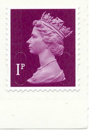
To end 2015 there have been a few slight changes in the most frequently used definitives but nothing very exciting I'm afraid. It's a dull fluor on both De La Rue and Walsall stamps issued in recent months. 

There is also a Business Sheet 1st Large coded MA15 MBIL.

And, oh yes, some Star Wars stamps. You can hardly have missed the mass invasion of philatelic journals by celebration of the film series and Britain's contribution to its success. With the very latest movie released this week Royal Mail must surely have received a sizeable contribution to the old coffers from LucasFilm Inc. for the remarkable additional promotion it has provided.

In amongst the many, many special issue stamps we've seen in both this and an earlier issue is a Prestige Booklet with the traditional definitive pane of eight plus a label. This brings us a Union Jack 1st for the first time in gummed style. The 1st and 2nd Machins are also new, being coded M15L MPIL. 


You will have to fork out a massive £16.99 for this. For that you do get 24 1st Class stamps, 2 2nd Class and that's £16.20 at present rates, making the Star Wars icon label 79p. So if you do decide in years to come that prestige books are pretty but pretty unnecessary in your collection and it is just the Machin pane you need there is a good chance that'll get your money's worth when rates increase in future years. That's the way I look at the prestige books these days. Occasionally there is something a little special but most of them seem little more than income streams for Royal Mail. I have yet to encounter anyone who has bought one in order to use the stamps. Indeed, I have yet to encounter anyone who has bought one in the last ten or twenty years who has not been a collector!

We should be thankful for small mercies, I suppose. Those who didn't join us in abandoning Post And Gos last year will have the most ridiculous job trying to keep up. Not only have the various military associations decided to have an intelligible name on the overprint instead of a set of letters, involving a mass of reissued strips but there have been new designs, added overprint logos and more from the Channel islands to boot. Here's the list of 36 strips you've missed in the last two months:

Union Flag Royal Navy Trafalgar Day
Union Flag Royal Marines Trafalgar Day
Poppy Royal Navy Submarine
Winter Greenery NCR Strip
Winter Greenery Series 2 Strip
Winter Greenery Wincor Strip
Poppy NCR with 15 date code
Poppy Fleet Air Arm
Poppy Royal Marines
Poppy RN Submarine
Winter Fur & Feathers Presentation Pack version
Winter Fur & Feathers  NCR strips
Poppy Series 2 15 date code
Winter Greenery strip with old Euro 20g value
Union Flag Royal Navy
Union Flag Royal Marines
Poppy Series 2 15 date BPMA
Union Flag Hong Kong November 2015
Sea Travel Hong Kong design strip
Union Flag Sindelfingen October 2015
Machin no date Sindelfingen October 2015
Poppy 15 date Sindelfingen October 2015
Heraldic Beasts Sindelfingen October 2015
Jersey Flag Sindelfingen October 2015
Jersey protected Species Sindelfingen October 2015
Union Flag Paris November 2015
Machin Paris November 2015
Poppy Paris November 2015
Heraldic Beasts Paris November 2015
Machin Royal Navy + Logo
Machin Royal Marines + Logo
Machin RN Submarine + Logo
Machin Fleet Air Arm + Logo
Jersey Flag Broad Street RAFA Jersey 90
Jersey Protected Species Broad Street RAFA Jersey 90
Guernsey Flag Envoy House Merry Christmas

What you might have had to lay out to stay vaguely complete might have been better spent going back and filling some spaces in old pages. That ½p left band, perhaps, or the scarcer 17p Northern Ireland type. You could even afford the rare 31p purple type! Or how about getting a nice Royal Wedding £1 or PUC £1?

Whenever I post anything these days my Post Office use, almost without exception, the 'Horizon' labels. These are the ones that used to be gold but are now more white. I do think these are quite collectable but, of course, you can only obtain these 'used' on items so they're not something dealers are supplying much at the moment. It is quite feasible to send things to yourself to get many of the various types of label and I am sure some enterprising dealers will be offering a service to supply these in due course but I don't think there is yet a great deal of demand to make it worthwhile. I do feel, though, that collecting these makes more sense than collecting mint strips of Post And Gos.


September 05, 2015

Post and Go. I give up.

That's it. I have made a decision. No more Post And Gos. Anyone who has been following this story for a while will know that I started happily collecting everything, first cancelling the Post Office presentation packs and then dropping all the pretty picture labels after a while, then the Flags as well and then the overprints, leaving what I thought would be a reasonably manageable and quite interesting set of Machin labels to follow.


It is pretty clear, though, that staff are putting the wrong rolls in from time to time and we're going to get 2nd Class values on olive backgrounds as well as 1st and higher denominations on blue. There will also be fading inks and font style changes as the months go by. Multiply each change by n where n is a very large integer representing different date codes or machines used and even normal versions will be rare. In fact, for many already released, the short phosphor varieties seem to be the norm and the 'normal' positioning types get sent as a 'variety'!

If I had seen more of these in actual use that might have convinced me to stick with them but we're dealing here with a label that lacks the scrutiny in production of the definitive issues and so may appear in all sorts of strange forms with mistakes and errors depending on who filled or serviced the machine last. The Post Office presentation packs are a joke and really are just 'for collectors to collect' being different to those in normal production. They look pretty but so do the porcelain cats on the back pages of weekend magazines.

My main frustration is that I cannot see how I can ever get anything resembling a complete collection as new denominations get printed on old stock so you can never close the file on a particular denomination or background as, at any time, a variety may emerge either by mistake or from a distant office with slow-moving stock.

Add the complication of umpteen overprints and many issues being available only at exhibitions or special locations for a few days and the dilemma of having, in the special picture label issues, 36 possible combinations of denomination and image - actually that is more now that extra denominations have appeared! - and you'll get the idea. Not only is the collection likely to be immensely expensive but it will never be complete and what might appear to be scarce could even become common some time later. All in all, not a good attraction for most collectors.

There was a significant hint about all this when the NCR open values came along, with almost any denomination you want appearing on the Post And Go format labels. Many dealers don't stock or supply these, although, as I said at the time, my view is that they are more like what I would describe as a 'stamp' and, if they become more generally available, I might still consider collecting them. That's quite a big might though.

Now I am quite aware that it is also quite impossible to have a complete collection of Machin definitives but, firstly, most do get issued for a postal purpose. Just the prestige books break that rule but we'll let that pass for now. I have serious doubts that most Post and Gos go to dealers and collectors. Secondly, there will only be one 80p pink with an M16L date code printed by De L Rue. Their security processes see that all their stamps are, indeed, identical. Yes, there may be errors and shades but you needn't worry about another coming out in years to come. If they do print another, it will be different.

Normal definitives are also on general sale. You should be able to buy them from any Post Office although I am aware that may not be the case nowadays but you can certainly get the Philatelic Bureau to send you any current items. That's not the case with the Post And Gos. If there is a machine in your local office then you can get them for yourself but otherwise you're reliant upon a dealer to get them for you and they'll come at a price as they have to stand around plugging coins into machines all day.

So I shall now take some pleasure in listing all that I have, in the knowledge that no more need come to complicate what is already quite complicated, and put them up for sale. The income I receive will mostly go to good Machin definitive causes!


September 01, 2015

The shades are more interesting

It took me a good half an hour or so to figure out just what the dealer had sent me this month as not a lot tied up with the invoice. The main problem, however, was not looking for amounts that might add up to the various figures paid but distinguishing between these three pairs and wondering why on Earth I'd been supplied with them anyway!


Here we have type IIA font on undated backgrounds for these values. I don't think I have the undated background type so may need these. They have short phosphor which is also inset at the right.


These are virtually the same but don't have inset phosphor. One of these pairs is surplus and as these were the more expensive they'll be what I either return or sell.


These are the same as some provided some time ago, type IIA again and still with MA14 in the background as before but these don't have short phosphor. So these or the earlier ones can go.

To be honest, the really interesting thing about all these is the shade difference - quite obvious as you can see. Now that I would collect. I think this was the shade of the short phosphor version too and the other pairs' darker shade is similar to their predecessors too so these needn't be retained but I probably will as it is a hassle getting them returned.


I could barely contain my excitement when the mailing also included three booklets, one which the Post Office had already supplied with the latest Concrete and Clay layout and these two providing M15L MTIL and M15L MSIL variants. I am pretty sure I have noted these before but they're almost new and rumour has it that one book has some new phone numbers and the other has some weird Welsh stuff on it. I do wonder why we don't have variants with Gaelic or even Cornish or whatever the Irish speak.The Welsh do seem to have special treatment and I am not sure there are more than 17 who will actually encounter these booklets and need to have a translation of To Check Postcodes and addresses for free go to.

This has been another tedious month but then August used to have nothing happening anyway so I shouldn't complain. I also thank my lucky stars that I didn't have to cope with (and pay for) the new 100g values on British Flora II and ist Class and higher values printed on the background intended for 2nd Class in British Flora III, yet another new naval overprint, RNSM on Machins and Flags, Sinpex overprints on two types of Flags (with and without dated backgrounds) and BPMA Postage Due 1914 overprints on Flags with MA13 background. Gosh. That's a lot. If you are still managing to keep up then well done. You must be exceedingly well-off. Or were, at any rate.


July 30, 2015

More C Types

No, that's not the predecessor to the predecessor of the E Type. It's a code that I am told is only used on 'Enquiry Office' machines distributing Post And Gos. No, I am still none the wiser either. But you'll need these to maintain a reasonably complete collection of the Machin Post And Gos.


Now, I can't tell which is which in these illustrations but checking the code numbers tells me that those above have MA13 in the background and those below have no year code.


These are likely to be quite scarce and make a nice group along with the 2nd Class items shown in the previous post. No, Post And Gos are not getting particularly interesting I'm afraid but definitely a lot cheaper since I reined back my standing orders!

Also appearing in the 2015 date codes are the 1st M15L MBIM from Business sheets and a 10p M15L Counter sheet issue.


My daughter actually went in to a Post Office to buy a stamp for my birthday card last week. She had noticed that I had put a 1st Class Rupert Bear stamp on a card for my brother (called Rupert) the week before and, knowing my love of Machins, had intended to put some interesting shades on the envelope to cheer me a little. They hadn't any with numeric values at all!

It hadn't occurred to me that we have no numeric stamp suitable for 1st Class or 2nd Class for that matter. You may have a book of 4 x 63p from 1997 perhaps but that was the last time we saw a 63p and you'd have to raid a 2010 Classic album Covers Prestige Booklet to get a 54p or go back to 2007 for any normal definitive.

I am surprised, though, that they don't stock the usual 1p, 2p, 5p, 10p, 20, 50p range which serves all eventualities without too many being required for any denomination. Anyway, i suggested that she buys some at a discount on Ebay where there are plenty going - and quite cheaply too!


July 04, 2015

No 12 across or definitives in the Philatelic Bulletin


This looks like a new font for the two 2nd Class Post And Gos, which I'll call IVA for now as it is pretty similar to the type IV with the bold smaller text for the code being the most noticeable. It is interesting to note how the text is getting ever smaller and the old style type 1 looks terribly out of place now. Odd that these are on an old backing but I am advised that these come from 'Enquiry Office' machines which had an office name line before but that's now removed. Not that I'm much the wiser.


From the same source, here is an error where the print has overlapped the edge but not, apparently gone on the backing paper or maybe it just rubbed off the shiny surface there.

Another '15' date code, this time for the 2nd Large stamp by Walsall and bearing MA15. Quite why they insist on that structure when everyone does M15L on other issues is odd but I shall not worry about that too much.

What is, perhaps, more worrying is the lack of any Machins in the July 2015 edition of the Philatelic Bulletin. Apart from two booklet illustrations where a block of four 1st Class Machins are shown with two Special issues in the familiar booklet format, and they're only shown as illustrations of the special issues, there are not even any illustrations of Machins. That, I think, is a first. The issue is almost entirely taken up with war items which, whilst appreciating their importance at this time, I do feel is being slightly overdone now as we will no doubt soon be getting previews of the November Remembrance stamps as well.

As well as no Machins, there were also no Post And Gos incidentally. Not a good issue for definitive fans.

The crossword also lacked a clue for 12 across. I don't usually do the competitions but this week, for some reason I cannot really figure, I completed both the stamp identification and worked out the answer to what was being spelled out by various squares in the crossword solution. The missing word was C_A_G_ which could have been CRAGGY or CLANGS but I decided it was more likely to be CHARGE or CHANGE and opted for the former, adding my own clue 'None for entry' designed to match the fact that there was no clue to there being no charge for entry to the competition. It was a bit forced but did produce a response from a nice lady at the Bulletin to complement me on completing it. Apparently the clue should have related to a solution CHANGE so I had guessed the wrong one but still feel a little hopeful that my first entry in probably 40 years may get me something. More news on that later. Prizes really are very modest.


May 30, 2015

In the postman's bag this week

I was telling my postman about the 1d black anniversary issue last week and as he'd never heard of them I suggested we have a look through all the mail in his bag and see if there was one there. Not only were there no 1d black anniversary issues but there there were no Post And Gos, no special issues and just two actual stamps, a couple of 1st Class reds, one which look distinctly as though it was being reused when we looked a bit more closely, despite all the security slits and awkward glue.

That was amongst the whole of his round still to be completed, well over 200 items which we just skimmed through pretty rapidly so may have missed something but I doubt it. Horizon labels were the main 'stamp' items amongst the bundle.

I am beginning to wonder just what the numbers would look like for stamps sold for postal use. I know that collectors are probably providing 99% of the revenue for special issues but the thought that we may be the principal raison d'être for most definitives too is saddening. I can't stop until the Machins stop but I am, for the first time, almost hoping for their end.

Spare a thought too for the Post And go collectors who have not cancelled orders for the non-Machin issues and overprinted issues. I've counted 22 new issues, not counting those illustrated below, three for the Heraldic Beast issue but most of the others all new overprints or old overprints on different labels. There are even some from overseas exhibitions. They would have needed well over £500 to fund that lot in an attempt to stay 'complete'!


The Cartor versions of the 1st black and blue are not Machins I know but these are nice stamps that ought to be in any British collection, although I am none to sure of the need for these 'Smilers' sheets. the facility to have a photograph of yourself or someone or something else professionally printed and appearing on a sheet of proper British postage stamps was quite a remarkable thing when it first came on the scene. It pushed most of our computers' graphics cards to their limits to handle the process and it was a bit tedious over dial-up but it was different, if expensive. The 'Smiler' issues that were available for the process also seemed vaguely appropriate but now you can appear next to anyone.

Similarly, you'll find a variety of labels next to these stamps but I'm not too bothered, being only interested in the variations of the stamps themselves.


Next we have the Post And Gos in a 'normal' strip with the MA14 date code and font IIA. the previous ones are all short phosphor variations, not that you can see much difference here. I shall probably sell the short phosphor versions if anyone wants them.


Now here's something interesting! Sme post office staff have put the wrong roll in the machine again and we've got 2nd Class values being printed on the olive background. It wasn't that long ago that we had the 1st Class and higher values printed on blue so this sort of balances things nicely. I like this pair. Because it is comparatively easy to do, I suspect that values will never be vast because it is simple for someone to recreate if they're a little mischievously inclined.


The Great War 21015 prestige booklet carries just three new Machins. The 1p, 5p and £1.33 have the M15L MPIL security codes. The small definitive size poppy stamp is attractive. The Poppy series of remembrance issues are quite exceptional designs all of them and would make a superb collection on their own.


A 2nd Class from the Walsall book of twelve with the M15L MTIL code.


De La Rue have a M15L code for the counter sheet 1st Class and 1st and 2nd Large issues too. In addition, it seems that they didn't do enough M14L Special Delivery stamps as that has now appeared with M15L after years of inactivity beforehand.


The Walsall 2nd Class with M15L MTIL comes from the revised booklet with slightly different text as we get yet more lessons in distinguishing between normal and large. I find that putting almost anything in my thickish C5 envelopes will stop it slipping through the device the ladies at Towcester Post Office use. How ever many times they put stuff on booklet covers or issue posters, there is really no way most of us can figure out how thick 5mm is. I am not too sure I have much of clue as to how heavy 100g is either. I know from my younger days that jars of jam are 454g but that probably includes the glass.

March 30, 2015

Better images for the 2015 definitive issues

Now I have the actual items I thought it wise to show them here as some of Royal Mail's illustrations suffered from more than a modest surfeit of green! First, the Regionals which I know are not Machins but I still collect them. It really is time the designs were refreshed, though. Why on Earth is there a different font used for each Nation? Weird.


Next the new values: £1.33, £1.52, £2.25, £2.45, £3.15 and £3.30 in colours that I am sure we have seen before. £1.33 amber yellow looks pretty much like the 35p yellow-olive or 88p orange-yellow. £1.52 orchid mauve could be 78p deep mauve or £1.90 bright mauve. £2.25 plum purple is 31p's deep mauve and £2.45's spruce green looks pretty much like a holly green to me. The £3.15 in aqua green is a bit different but the £3.30 reminds me of a 39p bright magenta or was it rhododendron?


The new 15 codes are here again too. 1p, 2nd and £1 M15L MAIL and a 2nd M15L MBIL


Next is something new. A 'Europe' value 4og issue from long ago with the high set value in a pale milky blue. This is a hard-to-find shade.


The Post And Go dual value single label is new because it has phosphor bands that actually synchronise with the label dimensions rather than starting or stopping short! So not exactly an awe-inspiring addition to the collection. And in a period when there are overprints of some Postal Offices' names (e.g. Crewe) emerging as well as yet more variations of fonts on Birds or umpteen permutations of whatever the latest pictorial is and probably more overprints too, it is a relief that the only additional two I shall need are these delightfully chopped off prints of the "nd Class issues.


Lastly for now, there are the 15 codes now for the 1st and 1st Large Signed For issues. I send mail every week that needs to be signed for but all my Post Office people ever use are the gold Horizon labels. These illustrations are not in proportion, by the way! Not sure what happened with those scans.


These items will shortly appear in my catalogues.