Some more recent information has come from Norvic Philatelics' blog.
It has all taken quite a bit of finding, though, so here I shall try and set out the basics to date so that, together with the last couple of articles and others to follow, you can find some degree of Chapter & Verse here by searching for Horizon.
The first gold labels were first trialled in Camden Town High Street in June 2009 with the first official issue being to Post Offices in Wales in April 2010. Before that, white labels with similar content had been around for some time. The white labels had no security features and were withdrawn in July 2010. I expect you'll come across white labels dated later where an Office had old stock to use up.

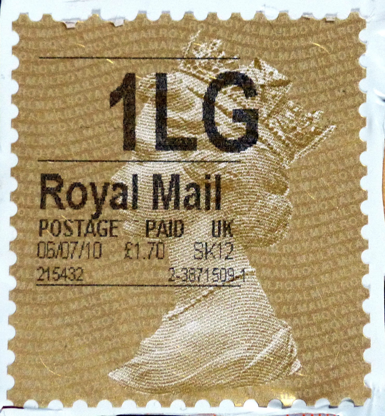
This is one of the early gold labels, with a bold font and the date in dd/mm/yy format.

Some time in 2010 the format changes to dd-mm-yy and the fonts and alignment are tweaked for a better presentation.

This pattern continued through to some time in December 2011.
In August 2010 an imperforate version was trialled in London and it looks like the first official issue date for what I prefer to call the straight edge labels (as the original 'perforation' was purely a design thing) would be 13 September 2010.
So the first straight edge issues will have the slits at top and bottom centre too.
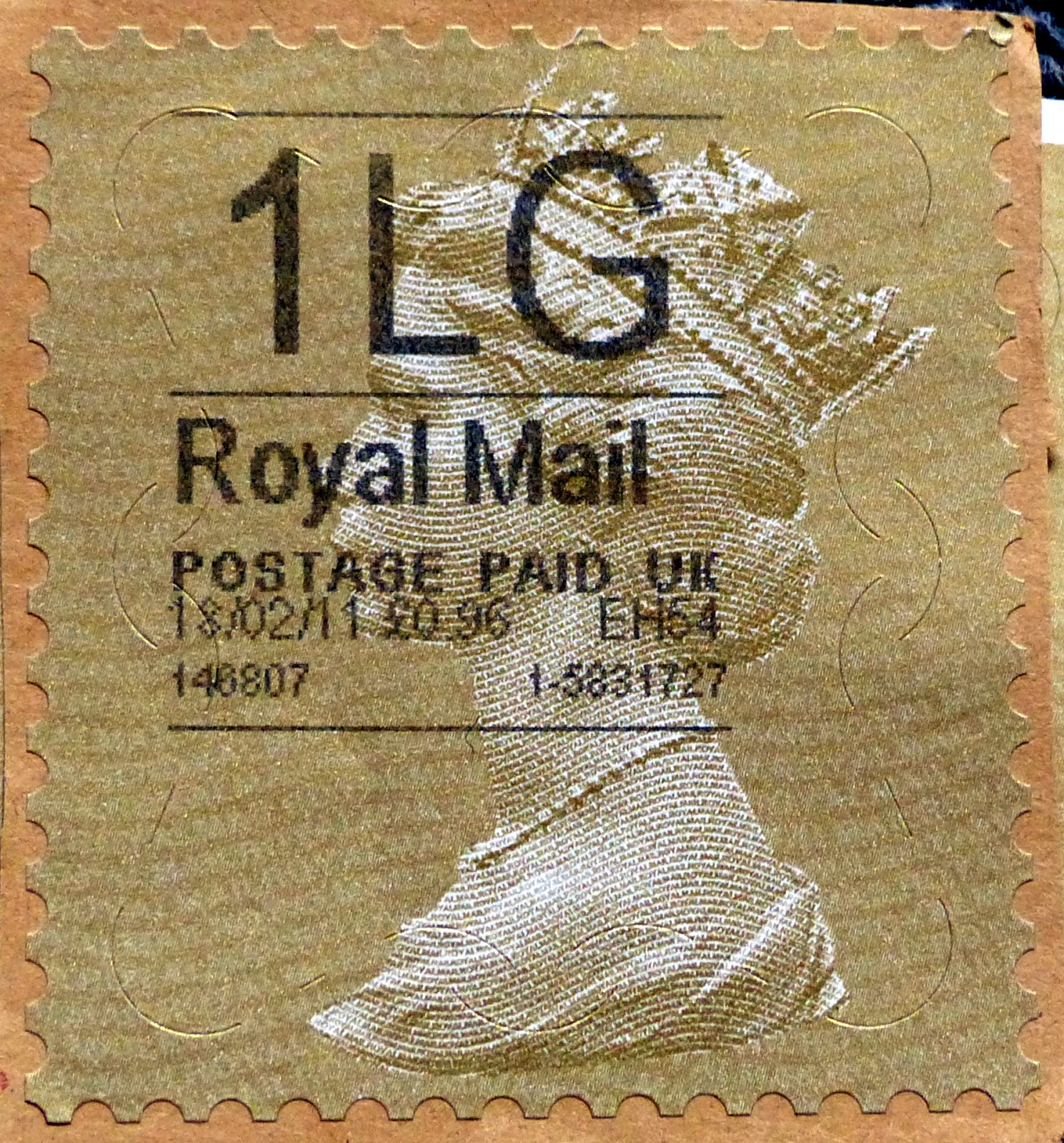
Shortly after release, at the end of December 2010 there is a change of software that prints the date in dd/mm/yy format again rather than dd-mm-yy
As Post Offices will have had stock of the old perforate-style labels the dd/mm/yy format will be seen on both straight ede and perforated-style labels for some time.
Both De La Rue and Walsall have printed the gold labels. I have not been able to find out when Walsall first came on the scene. I presume, as De La Rue did the trials in 2009, that they have been printing them all the time with Walsall coming in later. When I don't know.
The illustrations below indicate how you can distinguish between the two printings.

The Walsall printing has a background of what appear to be mostly continuous lines running slightly down to the left. There is a clearly discernible gap in the two sections of the corner slits.

The De La Rue printing has a much less clearly defined background, one person describing it more as a stream of morse code running, as Walsall's, slightly at an angle top to bottom. The gap between the two sections is very small and, indeed, the corner slit looks to me to be one section.
In October 2011 accounting codes are added to the data displayed.

As far as I can tell each service indicator has a different accounting code. So all 1Ls will have .b and I am not too concerned with what they may or may not mean.
Life seems to be fairly peaceful for a while now and it is not until May 2015 that we hear about the new 'white label. Officially it appears to go live in September 2015 and looks a little bit odd.

Slits remain at the right corners and down the right side only. There is a 'postmark' at the bottom right corner. I suspect that this element was designed by the same person who thought a perforation-style edge might make people regard it with the same respect they had for stamps.
Yes, there was a reason for the large white empty space; QR codes were added from November 2015, although clearly not in software at the Post Office in the illustration above!

A major redesign of the layout of data is now evident, with various code numbers or letters being placed in the postmark area too for reasons I have yet to understand.

At some point around September 2016 an adjustment is made to drop the Royal Mail text from the Signed For labels.

That would seem to bring things up to date, with these labels still being used at the time of writing and I have not seen or heard of any imminent changes.

The only other item is the similar looking Self Service labels that are now being produced by machines at some Post Offices. This was trialled in September 2016 and I have referred to this in my previous articles. Indeed it was this oddity arriving on a package that made me look again at the box full of Horizon labels that had remained more or less untouched for ten years. It is, though, a separate thing.
I have made a list of the different identifiers. View it at this link. (I have used this facility to avoid constantly editing this post). I make it 38, but several of those are replacements for others and not every group of labels will have every code, some being deleted before a change and others not being introduced during the period of another group. I would love to add some dates to when they were first enabled and when they were deleted so that we could make a better job listing what you might find (and save you looking for something that doesn't exist!)
I will keep looking and add data to the sheet as and when I get it.
The labels featured here are, in my view, worthy of collectors' time. At first glance they may seem a bit big and some are downright ugly but there is plenty for collectors to look out for. There is a huge list of service indicators although I am not too concerned with some of them. The BFPO ones, for example, I can happily ignore, and the Shopping Return ones which I guess only people working at the stores will see. I'll be happy to have one of each type by each printer (where both are available) and maybe an example from each year would be nice.
Whatever the case, these do have one big advantage in my book; they're really something used for postage and not merely issued for collectors like porcelain figures and plates in Sunday Magazines and it shouldn't cost the Earth to acquire a lot of them. Well, unless dealers start reading this and realising how few there might be of some types . . . luckily it is all quite complicated and, hopefully for a while, amateur Ebay sellers still won't tell the difference between the common and the good stuff.