Showing posts with label stamps. Show all posts

March 11, 2023

More QEII stamps with the Flying Scotsman


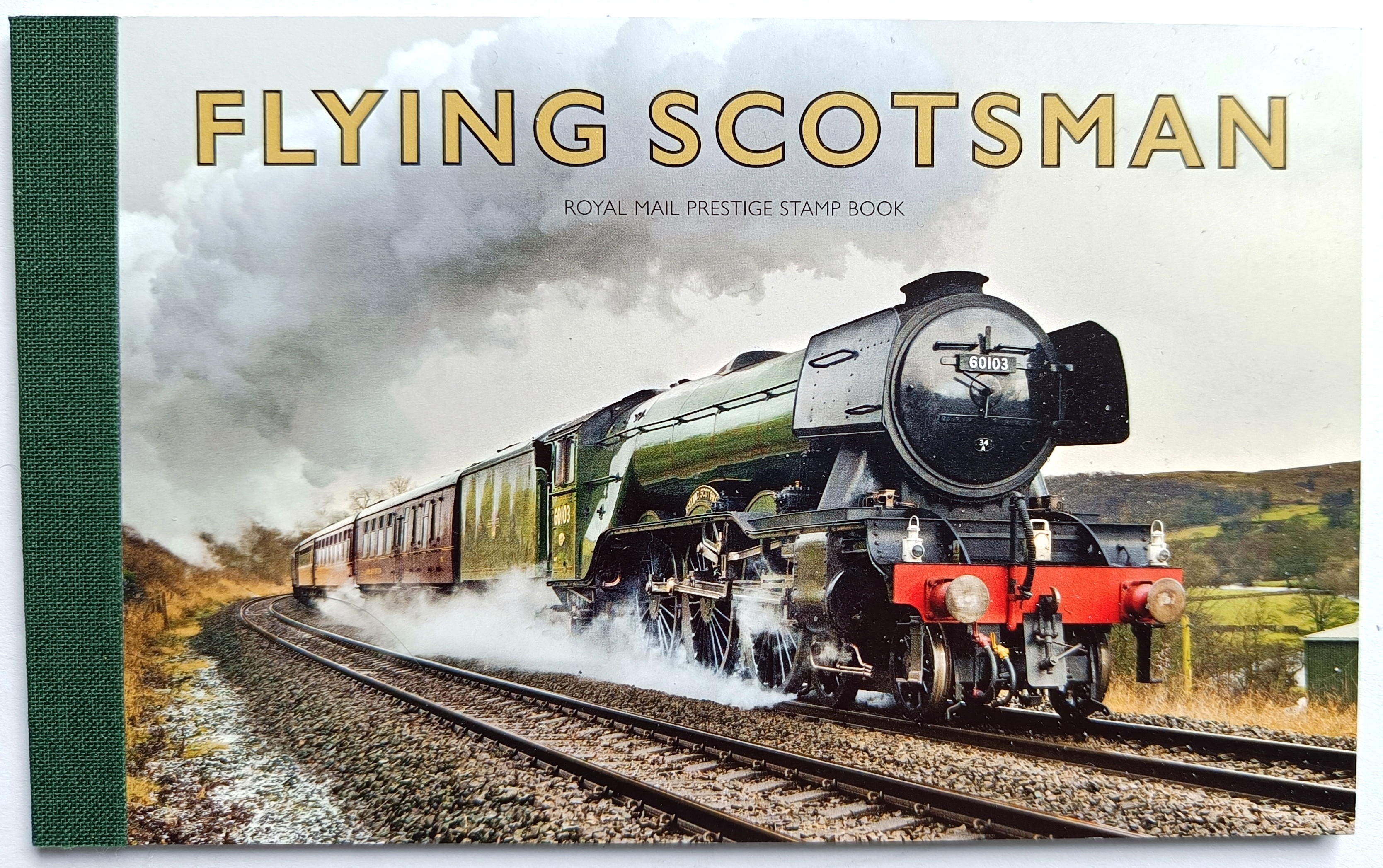
The latest prestige book would be a much more pleasant item to have on the top of the pile if it is the final one with QEII content. The content itself, though, with 12 different commemoratives and the now familiar bit still bizarre pane of Machins, is a hotchpotch that rather spoils the overall impression. Plenty of good text and illustrations for the steam train lovers but I don't see why 8 Flying Scotsman stamps were needed as well as a further 4 LNER or associated ones in a different style and format.


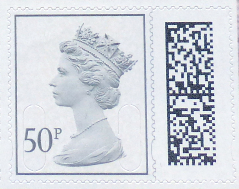
As for the Machins, where once there were 12 and then 8 there are now just four and, in this edition, only two denominations. A 20p green and a £2 blue. The head looks slightly paler on the 20p so I would say this is a separate issue for the collection (and, of course, the bar code will indicate its source too) and the £2 is the first from Cartor.

I shall stop collecting these books when King Charles takes over the panels. They are horrendously expensive now and, as I have said on many other occasions, the content is of minimal interest and the stamps merely one-offs which will be listed in catalogues as quite expensive singles but virtually never used as stamps. It will be quite a relief to abandon them. They remind me so much of those advertisements that use to be on the back cover of Sunday Magazines for limited edition sets of pottery, figurines or something. Along similar lines I have complete blue books of the 1977 QEII 25th Anniversary issues with stamps from probably every British Commonwealth country, including the Miniature Sheets and various variations on the theme available at the time. A colleague and I had committed to subscribing to Urch Harris for the whole lot but never anticipated the vast quantities that came our way. We bought the books to store them in, the pages and mounts and the whole thing went on for ever and cost us a fortune. Luckily I had a good income in those days and could afford them in the belief that they would be 'valuable' one day. No chance. I doubt I could sell the books for a tenner each now.

May 25, 2022

White spots before your eyes. Distinguishing the new 50p and £1.


You will see straightaway that the QR codes on the Prestige book stamps are quite different from the sheets issues. For a moment, I thought this would enable us to distinguish one from the other. But no, of course, as each individual stamp will have a different QR code and that will not help after all!

I suppose it is feasible that part of the design might remain constant to reflect the common source but I would need someone to advise me on that one. There will be something in the long string of characters that will be produced but identifying that amongst the mass of white squares is not something I am going to attempt without guidance!

The slight difference in size of the issues here is purely down to my inconsistent cropping of the later images. Apologies. The colour difference should also be ignored.


Update 16 June 2022

I am grateful to Lew Paterson for looking at the QR codes for these (and some other) issues. Here are his findings.

The 4 codes for these illustrations are:

JGB S19981017031001847760010025012201 F6B51D5D00FE2D5801

JGB S19941017031004573840010012012201 7A2413CCC098BDEB01

JGB S19981017031000997760005024012201 53FAA4B2899ACD6801

JGB S19941017031005321590005011012201 D1E0328AE6EDE24501


Possibly the first of each pair, has S1998 while the second has S1994 - could these be different source codes? Yep, just tried my own - S1998 is the Prestige sheet while S1994 is the counter sheets

Looking further, the counter, Book of 8, book of 4 and business stamps use S11 for normal stamps and S12 for large stamps with the last 2 digits in the 20s for 2nd class and in the 10s for 1st class.

First and last prestige book panes

I wondered out loud what might appear in Prestige books and here we have one. The Unsung Heroes Women Of World War II has what may be the face of panes to come.


Just five of the new style definitives with a slightly incongruous looking label. Now I am sure that the label is the same size as the stamps but it looks odd to me. Maybe the need for a label has gone, now that the pane is self-adhesive and not a sort of miniature sheet like we have had in the past.

The stamps are just two denominations, reducing the excitement still further - the 50p and £1 in what appears to be a pretty similar colour to the stamps we've seen already. Clearly, or maybe I should not say clearly as it is not at all clear without a QR code reader, the chunk of code on the right will distinguish these as issues from the Prestige Book but that would seem to be all.

Whereas the normal Machins of old had the MPIL part of the code after the year element M21L or whatever, these stamps have only M22L. MAIL appears to remain as MAIL across the stamps as far as I can see.

It is a little curious and could make used examples difficult to identify. Having said that, just how many used examples of these particular 50p and £1 stamps do we seriously think we will ever see? Apart from those that dealers post to themselves, my guess is zero. So let's not worry about that. 'Used Machins' is a subject for another day when I have a spare few hours to type and you have a spare few minutes to read.

I have not studied these in great depth and maybe we'll discover some difference in printing as I suspect that these come from Cartor and the others are from Walsall. I don't wish to offend the good folk at Cartor but, so far, I have found their end products rather lower in quality and impression than brothers Walsall and the masterful De La Rue, of whom we hear little nowadays. These seem rather better than previous ware - as I said, I cannot quickly detect a difference but I expect it will be a quality or finish matter that does distinguish these.

Presumably the last Machin pane in traditional style is, suitably, contained in the Platinum Jubilee Prestige book. This emerged in February but I forgot to write about it then.


Here we have some repeats in a 2p, 10p and 50p with M21L MPIL codes but a new £1.50 with this code. Indeed, this is the first time a £1.50 stamp has appeared in anything other than a sheet. It looks quite a bright issue to me and that might distinguish stamps from this pane from others if you encounter singles.


May 12, 2021

The Big Stamp with a Barcode


Just as you may have thought that there wouldn't be much more of interest in Machins, along comes the Big 2nd. It's big because it is 38mm x 30mm including perforations. the 'stamp' part, excluding perforations is 22½mm x 28mm compared to 18mm x 22mm for the familiar size stamp area.

Separated by a rather bizarre printed 'perforation' line is a panel containing what I believe is now referred to as a 2D barcode. I still call these things, whether square or rectangular, QR codes and the app on my phone is a QR reader but, whatever you wish to call it, this is a big new addition.

Each of these panels contains a set of characters which will be unique for each label. The one illustrated above and below have these sets of characters:

JGBS1123101703 114139229 00066 231120 01 D7F8DD75094BEF1 501
JGBS1123101703 123311783 00066 040121 01 140D0D76722095E 501


Messrs. B Alan Ltd have made some intelligent guesses as to the translation of some of these and you will be able to identify a date and a value fairly easily. One was printed on 23/11/2020 and the other 04/01/21, both having a denomination at the time of 66p.

There are other educated guesses they make regarding the position of the label on a sheet of labels but that's about as far as anyone can go. 

This label I can envisage having several purposes as well as the obvious security function. It will prevent the label being used twice without penalty when scanned by new reading devices at sorting offices. I am sure this happens a lot at the moment with very few of my stamps ever being franked or marked. The security slits do make them difficult to take off an envelope but I have seen plenty of instances where the stamp and backing have just been cut out and stuck on another envelope. You may think this is an obvious ruse but how do we know that someone simply needed to use a different envelope and the transfer is entirely innocent? So that's one purpose.

Another could be to enable us to track items to which this label has been applied. I can see an app being launched in time to come which will let us see where our post may or may not be

Something no-one has mentioned so far that I have seen is the possible effect of including a denomination. For many years we have been able to hoard piles of NVI stamps and defer payment of new higher rates. When a particularly large increase is announced in advance then there is a great incentive to go and buy as many as you can as the stock will be worth considerably more a few weeks later. I am sure people have done this and even sold sheets at a price to businesses that still represents a discount on the new rate but gives the seller a worthwhile profit. This new code will, however, specify an amount - 66p in this case - and I can well imagine that this could determine the 'value' of the label when used in part-payment of postage and, more significantly, in future when 2nd Class postage may increase to, say, 70p and we'll be asked for another 4p, or whatever the difference happens to be at the time.

It is suggested that the Big size is not a permanent thing and that the stamp area may reduce to normal size, with a proportionately smaller label to the side, and that this concept may be spread across some other denominations. 

I can imagine that there was much debate about whether to include the wavy line to imitate perforation and those promoting this won. Here's what a 1st Class might look like without it!


The second printing that I have of the 2nd Class issue has a slightly different shade and a much more reflective ink for the background. This does not show in these scanned images, however, but is most noticeble in daylight at an angle.

Both issues bear the normal code M21L MBIL.


Back down to normal size, there is a 21 code 1st Class Business sheet issue. M21L MBIL.

The 10p light tan has a bright fluor. Still M20L MAIL code.


A noticeably brighter shade of bright blue for this 2nd Class issue, from business sheets.


March 23, 2021

2nd Class stamps - yours will be unique, 1 in 20 million


A surprise in the post this morning - this new 2nd Class stamp. I had noticed a bill for a new 2nd Class stamp issued by the Philatelic Bureau some time ago and, whilst wondering just what was in store, I concluded that it might just be some minor change. Instead there is is this much larger item.

The label comprises two images, the traditional 'stamp' and a type of QR code matrix. To preserve the impression of the 'stamp' being a 'stamp' there is a wavy line incorporated in the design to make a printed 'perforation' between the two main images. I have to say that this looks odd and will only fool those applying the label to a blue envelope. But never mind. So what on Earth is this all about?

It seems a little OTT for just security but I understand that the code for every stamp is unique, with the QR code revealing (to anyone with a QR reader app on their phone) a string of digits which only that item will have. This will certainly make forgery less effective as the idea is that equipment at sorting offices will record the use of the string of digits and reject any further use through some form of intercommunication across the nation. I hadn't appreciated how much money must be being lost through forgery for such a lot of extra security printing measures to be justified. My guess is that the string of digits might be used in future to track an item's progress or, more mundanely, provide detailed data of items source and destinations for Royal Mail.

The backing sheet also contains the wavy lines of text in a similar style to that used across the self-adhesive range.

The stamp image has the same security features as we are familiar with, with an M21L MBIL code indicating that this one is from a Business Sheet which, I imagine, is the code used in most forgeries. Perhaps we will also see this available at counters and in booklets, together, naturally, with 1st Class items in similar vein to be seen before long.

A new page required in the album. That was not expected. I thought there might be development of a picture theme to replace the Machin head and it is interesting to note that the separation of the main code element from the stamp design does leave it quite possible for other designs of the 'stamp' to be substituted. I cannot see this device being rolled out to other than the NVI issues, however.

I would tell you more but I have not received a Philatelic Bulletin for some time, where I would imagine details have been provided. I had to turn to Norvic's Philatelic Blog for help and there you will find chapter and verse in fine style.


November 04, 2020

More 20 codes


1st Large Royal Mail red M20L MBIL
I am not sure why this is different to the stamp featured in the last article. Maybe the backing paper has the text reversed, which I don't list separately, and it has come by mistake.


The £2.42 value now has the very bright fluor that has been appearing a lot recently and is very noticeable with a UV torch but not without so if this doesn't concern you that's probably another you needn't buy.


You will need this one, finally getting its M20L MAIL code.


And this, the first appearance of M20L MSIL


And this, the first appearance of M20L MBIL


September 02, 2020

More 20 codes and some thin paper

 Here we have a few more 20 year codes and a couple of variations for the 1st Class red shade and its thinning backing paper.


M20L MTIL Much thinner backing paper

M20L MCIL Deeper red Queen's head from Sherlock book, also thin backing paper with very bright fluorescence

2p Dark Green with M20L MAIL

20p Bright green with M20L MAIL

M20L MBIL very bright fluor with a yellow tint


July 18, 2020

More 20 Codes and a Challenge.

Here's a challenge. Find a Special Delivery stamp in the Royal Mail online shop. I failed. Anyway, here is my own 500g example with the latest M20L code. This ranks as the #1 high value stamp currently available with what I think is a £7.50 value at the time of writing. The service is more expensive if you need more insurance cover and I wonder whether the same stamp gets used in such an instance, in which case it would have an even higher value! Or, now I think about it, maybe if used for the Guaranteed by 9am service, it would be the highest ever, easily exceeding the old £10 definitive.


Next, there are some more 20 codes. I don't seem to have noted the arrival of the 1st and 2nd Class stamps or their Large siblings as M20L MAIL in previous posts. There is also now a 2nd M20L MBIL which I seem to have missed. So here they are now, together with a 10p light tan.


The only other item of interest is a 1st Class from a recent Concrete & Clay book (4+2) which has a quite different and thinner backing which is also very bright when viewed under UV compared to others. It may have appeared before but this is from the Queen edition and is the first I've noticed.


Apologies for the poor quality images in this post. Having already put the stamps away neatly in my albums I was reluctant to undo all my work and risk not being able to remember what should go where so I just used my mobile phone and did not wait for it to focus on some occasions. But you've all seen plenty of 10p stamps and the different codes don't even show on most of them anyway. I should have used old images and no-one would have noticed.


July 13, 2020

End of WWII, Queen and some definitives


 I am rather late returning to this news blog and I shall just publish what I have found lying around and it may be necessary to explain later, add more or delete duplications.


6 April saw the issue of this miniature sheet to celebrate the Declaration of Arbroath. Not Machins but I include the small definitives in my lists and these will all be new being inter alia on gummed paper as well as having [correction, I'd forgotten that these have not made it to self-adhesive world yet!] pretty much the same as sheet issues but with maybe small design differences I have yet to spot. There are sheets with and without a bar code.

£1.63, £1.68 and £2.42 definives with M20L codes have also appeared in my post box. I shall have to conduct an enquiry as to how these differ from the 17 March issues (if at all). I may have to remove these, just bear with me in the meantime as I am a little behind! [Update: these are March 2020 printings and seem to have a slightly deeper shade of Queen's head, although I suspect that there is a more significant difference between the results of my scanning these and the original issues.)


The 1st large Signed For now has an M20L code, first appearing around March - April.


From the End of The War book, issued 8 May we have three new Machins: 5p, 50p and £1.63 by Cartor, all on gummed paper and coded M20L MPIL.


Two more Concrete & Clay books with 1st in quite distinctly different shades of red. Quite how each compares to the 'normal' shade I have yet to investigate but one will match and another won't, for sure. These are all M20L MCIL of course and not necessarily new unless the shade of one or the other is of interest.


Another prestige book, issued 9 July, brings the band Queen to the attention of all those who collect prestige books. This will certainly make searches on Google more complicated than before. The definitive pane would be better referred to as the definitive size pane as it features the lowest ever combined value of Machins in all the history of prestige books. (I think that is true, although I am now wondering about the content of the Cookbook!) Expect a revision of this bit too in due course, with evidence.

What we have here are four 1p purples for no reason at all that I can think of, with four 1st class definitive size stamps with a photograph of the four band members as they were in the 1970s, all surrounding a strange label from one of the album covers.

I shall have to list all this stuff but I would really be quite happy not to see another prestige book. Whereas once I would have been writing to The Times and all and sundry to complain if a prestige book came out without a Machin pane, now I would welcome it. I would neither have to buy nor concern myself with what is a mere money-making item for Royal Mail and of practically no postal use. Yes, we can use the stamps but I have only admiration for those of you who collect just used stamps and who don't cheat by buying two books and sending the contents of one to yourself or good friends!

Not that that would stand that great a chance of a decent postmark anyway. These days it would be more likely to arrive either just as clean as it left you a few days before or with some heavy scrawl across it courtesy of your postman obeying one of many instructions to help prevent re-use of unmarked stamps.

Back in the 1970s my dear old friend Ugo Vincent could be seen making his way slowly from Abbots to Kings Langley in Hertfordshire where the good people behind the counter in Kings Langley Post Office would spend a great deal of time carefully placing round handstamps on the stack of envelopes he prepared for his stamp collecting friends. Yes, my used collection of late 1960s to late 1970s GB issues are very finely used indeed!


March 18, 2020

UK Postage rates over the years


I have updated the charts I last published in 2017 as we approach the latest increase in UK postage rates. 1st Class rates will start at 76p and 2nd Class 65p from 23 March. You'll see just how good an investment NVI stamps have been, especially those bought in 2006 or thereabouts!

Acknowledgements to http://www.wolfbane.com/rpi.htm for the RPI data. The UK rates I have recorded myself for many years.

2020 New Definitive Values, James Bond and London 2020


The Queen Victoria 1d black, 2d blue and 1d red from 1840/1 return once more in a London 2020 booklet. You will recognise these from a few years ago when the 175th anniversaries were noted in 2105/6. I like the idea but the Queens head and value tablet placing has always jarred slightly with me. Having said that, I can't think of where else they could go. I might have been tempted to replace Victoria with Elizabeth II and change the text to 1ST CLASS and 2ND CLASS. In fact I might try that in my editing program and if it works I'll share the results here just for fun.

We also have a Concrete & Clay booklet and a Prestige booklet marking James Bond films.


The 4+2 booklet features  te 1st Royal Mail red with code M20L MCIL which we have already seen.

The prestige book pane has a strange combination of the Union Flag 1st and the Scottish Saltire 2nd so that's going to upset the Welsh and Northern Ireland people for a while. Then there are 2 very tired looking 2p deep greens and a couple of 2nd Class blues. the Scottish stamps have the later serif-style value tablet but the UK one is the older sans serif type, not that we've had the later type for that stamp. Now might have been a good time to change that although quite why we get this combination is anyone's guess.

This pane, being planned and presumably produced sometime previously, features stamps with the code M19L MPIL. The 2p looks very much like the one in the February 2019 book but the 2nd Class stamp looks, to me, a quite new 'baby blue' shade. It also appeared in the February 2019 book so I'll have to dig that out to compare. It'll probably turn out to be the same as Cartor would, I guess, just bring out the colours from last year in whatever process is used. Not a tube of paint, I know, but some sort of formula that can be readily repeated.

The main event this month is the issue of the new definitives, supposedly to meet demand for the new rates coming into force in a few days. This has become a regular March (or sometimes April) affair and I do look forward to it, albeit with some trepidation now that the combined total is £29.80!!


The official colour names are:
£1.42 garnet red
£1.63 sunset red
£1.68 tarragon green
£2.42 purple heather
£2.97 rose pink
£3.66 harvest gold
£3.82 holly green

I recognise a few of these.


The regionals are all just as we've seen for many years now with just new values. I can't remember seeing the black outline on the Northern Ireland higher value but that's probably my memory rather than anything new. Perhaps that was introduced when the font changed and I didn't notice.

Whilst these designs do reflect the nations well I am surprised they have not been changed since 1999. There are so many items or scenes which could be representing the four nations that could be used and I am also surprised that the designs have remained such that some values are not at all easy to read. I suspect that they are little used and no-one really cares. Those businesses who have sheets of them for particular product postage needs are so used to looking for the yellowy-brown or purple one that I guess staff don't need to bother about the value tablet either. One reason for retaining the designs, I guess.

Right, now to move once more rows of stamps from page t page to make room for all of these unexpected values. I really should have learned my lesson by now and left a lot more room between values.