December 13, 2016

Not known at this address...

For many years I have thought that there should be an on-line edition of the Philatelic Bulletin. I also hoped that someone at the Bureau might also publish all the old issues. It wouldn't be a massively difficult task with today's scanning devices and there are even free search facilities that can be added to sites.

I remember seeing index pages around January or February too each year. They'd be useful on-line as well.

So I was delighted to see the reply to Mr Holbrook's query in the December 2016 Bulletin.


I did think that www.bpb.london/0594 was a slightly unusual address but, at least, it was nice and short and, if you knew the year and month of an article, you could find the issue it appeared in. I know that .london is a comparatively new domain suffix and guessed that bpb dot anything more familiar must have already have been taken. Nevertheless it struck me as a little odd but I hastily typed it in to my address bar anyway.

Nothing.

I tried the same address without the /0594 bit. I wasn't allowed to see that. I tried all sorts of variations but without any success. So I am not too sure how Mr Holbrook will be able to 'enjoy the read'.

I also made another trip to the Royal Mail website, thinking that there may be some news there. Typing 'Bulletin' in the search facility brought up nothing even vaguely of interest to stamp collectors. Scanning the many places we can visit in the 'Shop' I found nothing like Archives or even Bulletin so I gave up and decided to write this grumpy old man's article.

As collectors we make massive efforts to arrange our stamps, booklets, panes, covers etc., keep them neatly in albums, boxes or whatever and, whilst we may spend a little while looking for a particular issue we can share our past acquisitions with enthusiasm and ease. Nothing like as much effort would be needed to archive and make available the British Philatelic Bulletin's content over the years. Those responsible for these things at Royal Mail really do need to show some enthusiasm too and make some effort. I am sure it will be much appreciated across the customer base and by researchers generally.

There ought to be a budget for this. It need not cost a fortune and, if staff are already well-occupied with sales, then I have a suspicion that some collectors would consider lending a hand for little or no recompense to get the job done. So many wonderful illustrations, snippets of detail and, of course, expert articles and lists.

So, come along Royal Mail. It is time to bring The Philatelic Bulletin on-line and let us search its archives on-line too. Or to publish a url that works?


October 27, 2016

1st Class gets a deeper 'Royal Mail' red colour. Again.

I forgot to mention in my last article that as well as a new font on the booklet covers, there is a new colour for the 1st and 1st Large too. It's Royal Mail Red. I did think we'd had Royal Mail Red before. Maybe we did but, anyway, this is significantly darker than the red we've had to date recently and will be regarded as a new colour by pretty much all of the catalogues.

I'll list the new arrivals in a moment. First there are some more bits and pieces to deal with.

although not as obviously different, there are some deeper blue 2nd Class stamps. The 2nd Class with M16L MBIL and MTIL codes and the 2nd Large with M16L MBIL and MFIL codes.


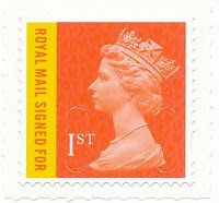
The Royal Mail 1st Signed For stamp has the M16L date code, no security backing paper. The Special Delivery up to 100g stamp now also has M16L code and no security backing paper.


Recent sheet printings of the 1st and 1st large are in the old colour but the 1st Large does seem to be a deeper red than before and the 1st Class a pale red with a pale Queen's head too. Neither have security printed backing.


Now for the Royal Mail Red stamps. You can see how obviously different they are, and yet I failed to notice when they arrived individually


1st Large with M16L MBIL and MFIL codes


1st Class with M16L MBIL, MCIL, MSIL and MTIL codes.


October 21, 2016

Mr. Fat booklet fonts

I wonder what inspired the latest font charges in the booklet covers released this week? There is some resemblance to the Mr Men text but I can't imagine that's the reason. Maybe it's just the Royal Mail going for a younger look. Interestingly, the 1 on the Mr Men book is considerably fatter than on the 4 x 1st Large book.


Inside, things are not terribly interesting and I do think there is a big space crying out for some self-promotion in the 1st and 2nd Large panels. We've seen the space used in the past for some very tedious stuff and I'm not sure I particularly want to see Sun Life Assurance Co. of Canada return with their £4315 for us at 55!! There's an opportunity for something that wouldn't cost a great deal to print and yet could reach quite a decent size audience and which could be better than a shiny white blank space.


I am assuming that the 1st and 2nd Large stamps themselves are the same as previous issues we have seen on the security backing paper. The 1st red M16L MCIL is new.

September 30, 2016

A paler shade of dark and 16 code surprises

Another pleasantly inexpensive month on the Machin front, I'm pleased to report. Not the most interesting, perhaps, but I did learn something. There are both MA16 and M16L versions of the MBIL (Business Sheet) 1st Large and 2nd Large stamps. The supplier lists them as both coming from Walsall which seems odd to me, with both being on the newer Security Backing Paper too. I'm wondering whether they're made a mistake there. Hopefully someone can advise on that as it really would seem most odd for the printer to have changed mid-production. When they start the 17 year code or maybe have a change of security backing paper that would seem a more suitable time to me to make such a change. 


The MA16 versions will be in earlier articles.

There is a new shade of 2p in a 'paler dark green' which is not really that much different to my eyes. The head is also stated as being in a darker shade of green, just to confuse anyone trying to describe this succinctly. 2p pale dark green with darker dark green head? That's a De La Rue one.


Also coming along from De La Rue are the Counter Sheet 1st and 2nd with M16L MAIL codes which I thought we'd already had but we hadn't!


August 26, 2016

Grey heads and a £1 from 1969 appears on an envelope in 2016


The English 2nd and Scotland's 1st lion now have grey heads on the sheet issues, replacing what were silver heads. The Scotland stamp has been seen in this guide before in the 90th Birthday book but is now likely to be appearing in general use. These are printed by Cartor.


The 5p joins the ranks of DLR's M16L issues, although this is not on security backing paper.


And, just for fun and fond memories, here is a selection of stamps that appeared on an envelope received recently by a friend. My guess is that the sender has purchased a whole pile of mint stamps at a discount. Quite good prices are available, especially for larger denominations from commemorative issues that can only really be used on parcels or tracked services. It is a pity that they have placed items on top of the edges of the London 1980 50p and I wonder what denomination was awarded to the Northern Ireland E regional? The others add up to £2.25. It would, I think, have been £1.05 each, giving a total of £6.45 which would have been the cost of a Special Delivery up to 100g. I am not sure, though, that the envelope alone wouldn't have weighed more so who knows.

Nice to see a lovely used copy of the original £1 Machin stamp from 1969. That remains one of my favourite stamps of all time. I am a bit surprised that it was going cheap, though, as mint copies of this I would have thought would be worth more than face value.

August 24, 2016

I prefer collecting items not intended to be collected


Now here's something I can collect. Indeed, I think we should make a real effort to get these properly accepted as 'stamps' and someone might make a catalogue of the various types available in due course.

I am talking about labels like this that actually get used on post. Not a lot, admittedly, but in my experience, a lot more than the Post And Gos that we are sold invariably in strips of six and with either a pretty picture or some text marking some event or worthy place and which will probably only appear on an envelope if a customer has ordered used copies.

I would also suggest that it is a used collection that we should aim for. I guess it would be comparatively simple to find someone to print out some mint examples and, whilst that's OK, it would be the postally used examples that would be the most difficult to build up and which, potentially, could be the more interesting and valuable in years to come when another generation takes a fresh look at all this.

What I am pretty certain about is that the mint Post And Go issues of the other type, even those with just a few days' Exhibition or similar life, will seldom be particularly sought after in years to come. In so far as they can be used in place of normal stamps in future, the Post And Gos will have a value but I suspect it will be often be rather lower than the equivalent face value which doesn't make them the best of investments either. Obviously there is a good chance that postal rate rises will outstrip inflation and rates available from banks and building societies in the foreseeable future but you would be better holding sheets of much easier to sell and use first or second class stamps than all the strange Europe and Worldwide rates you've been filling stock books with to date.

It is not really about its potential value but more about promoting a simple, good old-fashioned collection that I like this idea. My collection of these items is a pathetic dozen or so but it is far more appealing than all the pristine strips I had accumulated.

It needn't be a Machin thing either as here are some mint items from the Spring Flowers issue:


August 17, 2016

No prestige Machins and Birthday book design errors


The 2016 Prestige Book finally arrived yesterday. Delayed from June due to an error in the Presentation Pack. I cannot quickly see why that meant we didn't get the prestige booklets but never mind.

As it happens it contains no Machins. That has got me wondering whether this is the first prestige book not to have any Machins? Something I shall have to consider.

The definitive pane has the very attractive small Poppy 1st Class stamp, the newer style English, Scottish and Welsh flags and the familiar Northern Ireland fields. Whilst the English and Scottish flags are quite well-represented, the Welsh dragon really does not seem to have coped as well with the rippling and perspective effect. You also do have to wonder why no effort seems to have been put in to come up with something other than fields for Northern Ireland! 

I have often suggested that scenes from around Britain could be a good future definitive theme and if flags presented problems for the Northern Ireland issue then they should think of something else that would be suitable for all four nations.

I shouldn't worry too much as few people other than collectors will see this particular production anyway. Whilst the booklet, as the preceding two have been, is very well written and illustrated indeed, my interest in the prestige booklets is rapidly diminishing now. That is not just the lack of Machins but for many years it has been mostly just one pane that I have wanted and the chances of any of these being used in a postal sense, always slim, have become almost negligible. When they were promoted in Post Offices and you could fairly easily tear off a few stamps for use on an envelope then it was worth checking your mail for that scarce used copy of a left or right band variant or one from a different printer perhaps. Nowadays you could spend a year and find none. Or probably even longer.

Because I feel that there may not be long to go before we finally see the conclusion of the Machin series I shall not stop now and, for the sake of completeness, I'll keep collecting the prestige books and hope that they don't get too expensive. (Of course, there have been the annoying 'Special Edition' prestige books but I am hoping that these continue not to have different printers or anything that might make the definitive content unique. Now that would be really annoying!

On the topic of booklets that have stamps we might see on mail, here are a couple that you can reasonably expect to be used as intended and not just bought and filed away. The Concrete & Clay booklets have been with us for a while now and work well, 


The second book, ostensibly celebrating H M The Queen's birthday a second time, has four O16R REIGC amethyst 1st Class as has the other Concrete & Clay book with some nice landscapes.

The birthday book is a little strange, though. A sort of half-hearted effort has been made, by the seems of it, to mount the two photographs on some wall, presumably in Buckingham Palace but all that results is quite a confusing jumble of lines that stop and start. It really does not work and is not the sort of design that I would have expected to have survived through to print. 

It was the same with the first birthday book of 4+2 but I didn't notice at the time. They have taken the four stamps from the 90th Birthday prestige book and included them in these panes. Unfortunately, the prestige sheet was one large image and so various bits of background were included in individual photos selected as stamps. In the Concrete & Cay books, however, someone has attempted to put a background  in which simple doesn't work. For most issues they leave the background plain or presented in a way that enhances and does not interfere with the stamps. Notably, for Morecombe & Wise a while ago they were able to extend the photos really successfully, presumably by working with some original stamp design artwork. Someone should have had words with the designers on this occasion. Bit late now.


The landscape issue is pretty enough and a more suitable background is used.

All the Machins have the now standard 'security backing paper'.

July 28, 2016

Beatrix Potter Again


Now I have always been an admirer of the wonderful drawings of Peter Rabbit, Squirrel Nutkin and friends in the Beatrix Potter tales but I found the stories themselves really hard work to read to my children. For me, there was no flow to sentences and I struggled to make them entertaining for the young audience and got on a whole lot better with C S Lewis, A A Milne and Roald Dahl. Beatrix Potter was my mother's favourite, though, and maybe it is a generation thing.

There seem to have been lots of Peter Rabbits on stamps over the years too so I was quite surprised to find the lady was getting another outing - and with a second Prestige Book too! The last one was in 1993 so probably long enough ago for most people to have forgotten!

Luckily for us Machin enthusiasts, the pane of Machin stamps is still a feature and this year we have four new main line stamps to add to the lists, three from the pane and one from the Concrete & Clay booklet.


From the pane there is a 5p brown M16L MPIL with two phosphor bands, 10p tan M16L MPIL with two phosphor bands and £1.05 gooseberry green M16L MPIL also with two phosphor bands All are gummed with the usual ellipses in the perforation.I am assuming these are from Cartor. The text says International Security Printers. I believe that could be Walsall, Enschedé or Cartor nowadays.

My pane also seems to have very weak phosphot on the lower 5p such that it is almost invisible but that is more a specialist variation and, indeed, may still display as a normal line under a lamp perhaps.

In the 4+2 booklet there are four Long To Reign Over Us 1st Class amethysts O16R REIGC stamps, self adhesive.

Also in the Royal Mail envelope this morning was a new 6 x 1st booklet with a gold padlock design and The Future In Safe Hands on the reverse. I have no idea what this is all about. Is that the Royal Mail telling us that our letters and parcels are all nice and secure with them, as some sort of promotional campaign to prevent us switching to other firms? 


The stamps are 1st red M16L MSIL as you'd expect and I am guessing that they are from Walsall. There is a security print background to these self adhesives too which I think will be the first for the 1st Class red. The iridescent background shows the text in quite a fat and very clear style on this issue.


July 06, 2016

Another entry in the 'When Is A Stamp Not A Stamp' competition.


This arrived this morning. It looks like a normal 2nd Class Machin stuck on an envelope but it isn't. The stamp design has been printed on the envelope and it also looks as though the cancellation and other entries below were printed at the same time.

I remember Machin design 'stamps' being printed on envelopes and cards years ago but I have not seen anything like this at all for a long time and certainly not featuring something so similar to a current 'normal' stamp. Even the perforation has been printed and that I certainly don't recall noticing before.


The use of a QR code suggests it isn't an ancient type of label being used rather later than intended but something reasonably of the moment.

It would be nice to know what this is all about. Is it someting commercial organisations can buy in bulk? My guess is that it has been printed by the organisation under some kind of licence (like we can print our own labels on-line). I tried tweeting and mentioning @RoyalMail which usually gets a response but nothing of help has appeared so far and it will now have disappeared from everyone's streams anyway.

It may well be that some of you get hundreds of these and have been getting them for years and my rather limited amount of post has precluded my seeing any. A brief note as to what others we should look out for would be appreciated from those who know.


July 02, 2016

Stamps you'll see on envelopes and labels you can buy in museums.


The 1st amethyst in a slightly deeper shade from HM The Queen's 90th Birthday Concrete and Clay booklet by Walsall. Apparently, it also has much brighter fluor. I must buy a lamp one day as I am clearly missing out on all the additional differences there. It would also have helped me considerably in the 1980s. Remember All Over Phosphor, Phosphor Coated Paper, PCP2 and variations on these themes? I tried to distinguish by holding stamps at various angles to see which were shiniest, not to much avail. That's when I finished up subscribing to a dealer's standing order and just trusted whatever he sent, carefully writing AOP or PCP1, 2 (or even 3 I believe) below the Hawid mount on the page!

The 1st amethyst also has the security backing paper by the way.


A 2nd blue from the books of 12 by Walsall with the M16L MTIL code that is new to the lists. This also has security backing paper. 

A new printing of the Scottish 2nd Centre Band Saltire by Cartor now has a grey Queens's head instead of silver.

From the Great War: 1916 booklet pane come the four National stamps that are similar to those in the Football Heroes booklet from 2013. These have what are termed vignetted phosphor bands instead of the solid type of 2013. These all have a duller fluor than the earlier issue. All from Cartor.


Post And Go collectors will have had another expensive month or two with four strips from the World Stamp Show in New York and a mere nine Battle Of Jutland overprints. I am so glad that I gave up on these. As a collection I am not even that sure they look particularly attractive. One possibility might be to have just one label for each issue, type or change instead of the standard strip of six or whatever is dished out by the machines. The idea of getting each value with a different image is bad enough when that leads to thirty six labels having to be purchased but should the system progress to having a wider range of denominations added then life will become impossible and all but the very rich will have to have something other than everything.

I get lots of parcels each week in connection with my Corgi Toy catalogue project and occasionally these feature the new NCR type label with an amount and service printed on an olive or blue Machin background. These I do find interesting but, strangely, are not regarded as worthy of our consideration by many, if any, of those who might supply us with regular issues. In my view these are far more like 'stamps' than these endless streams of labels issued almost entirely for sale to collectors and exhibition or military museum visitors.

Unless you are an avid collector of military memorabilia or have a specialist collection on the theme of Exhibition or Museum Issues I am pleading with you more general Machin collectors simply to say 'Enough is enough' and cancel those standing orders for strips of six of this or strips of six of that henceforth. Draw a line in the album. By all means get one example from each new issue that you believe has come from a machine with some reasonably likely postal purpose but the cessation of guaranteed demand for the overprints, in particular, might dissuade the Powers That Be from continuing with them other than for very limited interests of a non-philatelic nature. Maybe you can start collecting the NCR types instead and, who knows, they might even prove rather more representative of Britain's stamp future in the collections we pass on to our grandchildren.

May 28, 2016

Another space needed just to the left of the 20½p blue.

Not the most exciting of months but, mercifully, a rather cheaper one than most! The new arrivals are simply two Walsall items with 15 codes that are now on security backing paper, two Walsall 16 codes on security backing paper and two new 16 codes from DLR on normal backing.

1st red Walsall M15L MBIL with security backing

1st red Walsall M16L MBIL with security backing

1p maroon DLR M16L normal backing

20p green DLR M16L normal backing

2nd Large brt blue Walsall  M16L MBIL with security backing

1st  Large red Walsall M15L MBIL with security backing

1st large Walsall M16L MFIL with security backing

I imagine that the security backing will become a standard affair before long and there will be quite a few new entrants once the counter sheet stamps start to emerge and more booklets too. So this year may well see several examples of the same stamp with and without the backing text but, hopefully, next year will settle down and each will remain peacefully one or the other.

I had precisely one Post and Go Machin - a 2nd Class Small Parcel £2.85 denomination which looks attractive on the package but still doesn't make me regret not seeking to collect all these as mint. I do believe that a used collection of these items is worth following, though, as, unless I am extremely odd and others are getting piles of these every day, they will be comparatively scarce in years to come and an interesting observation of stamp life in the 20 teens or whatever this decade will be called.

On the subject of being odd, I must apologise to readers who wondered what I might have been drinking before writing recently about celebrating the Machin 50th. That will, of course, be in June 2017 and not next month as I had indicated!

I also write on the subject of Corgi Toys. Now they do have an important anniversary in July this year, marking 60 years since their first Corgi Toy models appeared. An Austin Cambridge, Morris Cowley, Vauxhall Velox, Rover 90, Riley Pathfinder, Hillman Husky, Austin Healey, Triumph TR2 and some commercial or utility vehicles came onto shop shelves in July 1956. Unfortunately, Corgi appear not to be doing a great deal to mark the occasion at all. I have seen a strange Milk Float to be released as a special item but that is it.

Actually, bearing in mind the huge publicity given to several companies recently in stamp issues, one marking the occasion might have been a nice idea, had I thought of it earlier.

Anyway, apart from you now needing to extend your 1st red pages even further and having to try and squeeze yet another 20p green on the page - just in front of the 20½p - it remains a fairly gentle time in the Machin world.