50 years ago today, these three stamps were issued, the start of a long and fascinating list of Machin definitives still going today.
I was still 14 and 3/1d was quite a lot to fork out in those days, especially as I would have had a first day cover and some tipped examples too, requiring about 10/- if not a shade more. This was also the day that I met my dear old friend Mr Vincent. He would walk from the Booksellers Retreat to Kings Langley Post Office. That was a fair trip for someone in their 70s too but there he could count on a carefully positioned postmark being applied to all his collector friends' envelopes and a few attached to a white sheet to be supplied as used copies.
To mark the occasion Royal Mail have produced a fine prestige book - two in fact but I can only afford the one without the silver medallion and display case. I am pretty sure the stamps will be the same.
There is also a simple booklet of 6 1st Class red and some quite attractive Post And Go stamps in Machin style and in six shades that are inspired by the original definitives. As they stand they are certainly nice to look at but they'll just be the usual pack issued by Royal Mail that are unlikely ever to see real envelopes or parcel paper. If each shade is supplied, however, to machines across the nation then there will be quite a few to collect as in the case of the pictorial issues. If they start adding overprints then I fear for the credit-worthiness of those who still feel obliged to collect them. I may have to pick up a set of these on this special occasion but I'll stick to the simple 1st Class values.
There is a rather less attractive set of stamps (also included in the prestige book) which display the design of the definitive at various points but these stamps don't work for me. The booklet has an excellent and well laid-out and illustrated timeline but this set looks bland and I can't see it being that popular.
The best thing of all, in my opinion, is a pane of 4 £1 stamps in the prestige booklet. They are printed in what looks like gold foil, producing a wonderfully shiny surface on stamps the same size as the 1969 high value issue. I can't imagine postmarks staying long on that surface but I may be wrong. I intend to get hold of a supply of these lovely stamps and use them on parcels for a while. They're too good to leave lying in a book.
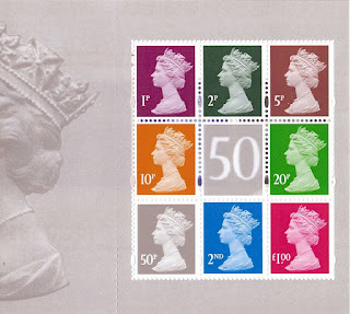
The other panes show the different Machin stamp designs over the years, (including the ghastly PIP one which still stands out like a sore thumb!) The centre label is a magnified section of the 50p high value issue in dark grey rather than its original ultramarine.
Another pane has some of the current range but only the £1 has the iridescent code. I remember how I used to write regularly to suggest that (much as I like the range of values as a collector) they should think about issuing just the 1 - 2 - 5 - 10 - 20 - 50 - £1 - £2 - £5 values which would enable all rates to be met with just a small group. The centre pane would seem to be no more than a representation of how 50 now appears in contrast to the first appearance.
The booklet cover is smart. Reminds me of the slide I created for my talk about Machins to some people in St Albans a little while ago.


No comments:
Post a Comment