March 27, 2014

No, I didn't leave the £1.47 stamp in clothes that got washed by mistake

 
 Post And Gos continue to multiply. Now we have the definitive set with the new Type 4 font and these appear, annoyingly, on background designs both with and without the date code MA13. You'd have thought they would at least have made that MA14.

Furthermore and further requiring credit card action are two more overprints. Stampex 2014 and The BPMA continue to get publicity from these issues. They, too, will appear in two versions, dated and undated backgrounds. Strangely, I took the decision not to collect the overprints but still get them on my standard order with my dealer but I don't get the Flags changes. Something odd there which I'll have to attend to. The Flags are a sort of alternative definitive that crops up from time to time when no-one is too sure what roll to put into machines. It really does seem to have a pretty random appearance profile which is why I would actually like to have them and will just put the overprints up for sale.

Flags will be appearing when I get them. For now you need to look out for them with the new Type 4 font with and without MA13, and in Type 3a font a BPMA Postage Due 1914 overprint again ith and without MA13. (I am presuming it'll be MA13).

As if that were not enough additions to my catalogue list, a batch of 1st Class Stampex 2014 normal definitives were issued with the value inscription 1st Class Large instead of the usual 1st Class. I wasn't lucky enough to get these overprints by mistake, just the corrected ones. Odd that.
Back to fairly normal Machins the 1st Large and 2nd Large stamps from Walsall now have Type 2 slits - there is a clear break top and bottom - so are new stamps. They have MA13 and MBIL in the overprint, being from Business Sheets. Now, it may just be me or the light here but they also seem to have a very bright and clear iridescent overprints. I am sure a new process is being used for that.


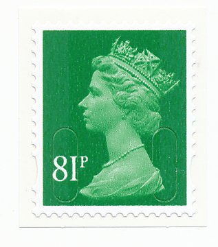
A recent, not very much published change in postage rates has brought along the usual Spring new definitives. There are four new additions to the amazingly still growing list of Machin denominations. Wonderfully bizarre values: 81p, 97p, £1.47 and £2.15. The £1.47 appears to have been left in someone's pocket during a wash cycle but that really is the true colour and not my scanner playing up. I suppose the postmarks will be clear but I would be quite disappointed if I have handed over £1.47 and had that in return. The surface of the 81p, in particular, looks quite scratchy when compared to older issues. All except the £1.47 have blemishes I am not used to noticing. It will be interesting to see whether this is something that all Machins just have and is neither here nor there or whether it is a significant quality matter that gets addressed and, of course, either the replacements of the originals then become collectable in a big way.

 
The Regional issues get in on the act too with each issuing a 97p value. In what must be one of the longer running designs now I think about it, the Northern Ireland lace, Welsh blue (why blue anyone?) daffodil, Scottish thistle and English oak now have nines and sevens inscribed where one were just eights and, in 2001, just the letter E.


March 18, 2014

Royal Mail Stamp Reproductions - worth starting a collecting now.


This was issued in 2000 to celebrate the 160th Anniversary of the 1d Black. Quite rare these days, the packs can be found at dealers and at auction but expect to pay £30 or more.


Issued 8 May 2010 and featuring the stamps that most collectors don't have in their British sets! The reproductions are marvellous.Still available at the time of writing at Royal Mail's on-line shop for £5.05!


Also still available at Royal Mail's on-line shop at the time of writing is the 15 September 2011 issue for the 170th Anniversary of the 1d red. I am not sure why such strange numbers but maybe that was the best they could find to have an issue for in 2011. A very good buy at Royal Mail still - just £5.95


The 2012 Facsimile pack had an Olympic theme and recreated the 1948 issue. I guess that was the last time the Games were held in Britain. An even stranger number, 64th Anniversary. These are not available from Royal Mail and must have sold out in 2012. Still available at dealers and auctions for around £18.

The beautiful Seahorses high value issue came out on 19 September 2013. Now this time they got the numbers right with a 100th Anniversary. This is still available at Royal Mail for an extremely modest £8.95.


Due out on 25 March is the Festival of Britain facsimile pack. Hmm.. 63rd Anniversary? This is, perhaps, not the most appealing of the packs issued so far but it's only £5.95 so worth getting for completeness and we'll wait and see what they decide to celebrate in 2015.


This was a nice stamp around in 1915. That'll do!

Seriously, though, these packs are excellent items, well-produced and featuring, so far, interesting an attractive stamps and comprise a collection that you can start now and maintain at modest cost with some reasonable hope of keeping complete too!


February 26, 2014

Prestige confusion and more Spring flowers than you may think


After all the effort I made to try and figure out who International Security Printers were it seems that the Loco prestige booklet was printed by Enschedé. Now, they may also be part of the magic ISP group but until I know more please accept my apologies for any rubbing out you now have to do in your records. So these are all new - four Regional pictorials and the 2p and 5p. You'll recall that the 5p Enschedé in the Merchant Navy book had ellipses near the top. And the last 2p was Cartor.


Another new find - no not a dark blue or black 2nd, that's just my scanner misbehaving and I'll replace the picture when I next use it - is a 2nd blue code M12L MRIL from Walsall. This came only in the coil issues used by big firms. Rare mint but you may encounter some used copies in used mail. 

A new set of Post And Gos is here. Using the same quite bland style of image but the subject matter does cheer in contrast, you need to look out for three different versions already! The first will be the usual strip sent out by the Philatelic Bureau, never to be seen again once installed in an album or box. They have font style 3 as before.

Then you need the nice new font style 4 shown above. These are from new Hytech machines - well, new software in old machines - and have a much more attractive and well-positioned text element.

Lastly, the usual Wincor mchine is printing them with font style 2, annoyingly still misaligned but at least easily identifiable!


February 22, 2014

Walsall + Cartor = ISP - Courvoisier

A new prestige booklet is out this month - Classic locomotives of Great Britain. Royal Mail know very well that there steam engine fans are inevitably either stamp collectors or unable to resist nice stamps with trains on them!

It's an OK sort of book and a better topic than some we have had but what interests me is the definitive pane. I do wonder just how many prestige books they would sell if there wasn't a definitive pane! 


The Philatelic Bulletin announces that these were printed by International Security Printers. That's a new name to me. I must have missed an article or news about this but discovered from a quick search that Walsall bought Cartor and, together with another France-based printing firm, Courvoisier, formed ISL as an umbrella group for this sort of quality and security work.

So, to all intents and purposes, the stamps are printed by Cartor, on the same equipment as before, so the 2p and 5p may not be new Machins, nor may the pictorial Regionals be new either. We'll have to wait and see as no doubt someone much more technically informed of the process will tell us before long.


I don't see any changes for these 1st class reds, the latest foursome in what is now a fairly permanent feature of 2+4 in a booklet. What makes this booklet amusing is the strange alien / ghost-like image to the wright of the footballer on the blue panel! It may not be obvious on first glance and you may even find that you have to view the actual stamp to see it but it is definitely odd - an unintentionally so!


January 29, 2014

My New Year Resolution: to put real stamps on my post


You'd be forgiven for not leaping around with enthusiasm at what 2014 has to offer in January. While we await the first sighting of an MA14 (presumably not an M14L but you never know) all I can entertain you with is a deeper fluor 1st red from the Walsall books of 6 and some short bands, apparently inset left although I can't for the life of me see that, on the Machin Post And Gos with font type 2.

At £25 for the former and £45 for the latter we're talking about some items that will hopefully be pretty hard to come by. I am not terribly interested in either, though, so one copy of each will be easy to track down if anyone's interested!

And that, dear collectors, is 2014 for now. I know, hardly worth opening the link. Sorry. Here are some other bits and pieces that arrived this month which will cheer up the post a bit...

The first is the wonderful Miniature Sheet issued in 1990 for the Penny Black 150th Anniversary.  You can buy these for under a pound so I did. I had given a couple away as birthday presents and was amazed at how cheap replacements were. That makes me feel slightly guilty about my apparent lack of generosity but I am hoping the people concerned will go for the It's the thought that counts option. Seriously, though, where else can you get such a beautifully printed and presented 1d black (well, a copy of a 1d black)?

Next in my mail this month was this odd little item from a mere 52 years ago. Again, costing next to nothing but featuring what appear to be three 'stamps' that look the same size as their issued counterparts in violet, purple and green respectively. You wonder whether they could have been cut out and actually used. Maybe I am just a little uninformed but I am surprised that a bunch of stamp collectors were allowed to print such an item. Even Scottish ones.

Looking at the mail itself, I have noticed a marked increase in use of the gold Horizon labels. I seem only to get VAT codes d, f, g and y. I looked around for an up-to-date list of letters and VAT codes but I am still searching. Postagelabelsuk.com have a list that needs some attention.


These are not easy items to collect. At the moment they're just accumulating in a box but the time will come when I need to do something. In some case I have had to add some backing where the label has partially come away - the backside is extremely sticky and if you're not careful you'll ruin whatever it happens to come in contact with. Currently everything seems to be the latest Walsall type 3.


The Horizon labels also do the Special Delivery thing too. That's a shame because the stamps are attractive and not that easy to find, with a hefty purchase price. They are still the MA10 variety so it looks as though more than enough were originally printed.


It's also just nice to get stamps on envelopes these days. It happens rarely and when it does is quite a nice surprise. This was particularly welcome - and also quite intriguing as the second highest face value available in June 1970 now pays just the 2nd Class rate!


December 13, 2013

Look For Two Robins This Christmas

The robins are back once more. Twice more, actually. There is the 'normal' festive stamp using the robin image from Birds I and most have the MA12 code but a few are emerging now with MA13 and are worth looking out for as they're likely to be decidedly scarcer (although we may have to wait until next year to be sure!)


This version has type 2 font.

Apparently there is also a mobile Post Office running around the country for reasons not entirely clear. This serves out Robin Christmas Post And Gos from the Hytech machine producing font type 3a.


The sharp-eyed among you may spot that the latest 2nd and 2nd Large Post And Gos sport synchronised phosphor bands which don't stop short of the edges as the originals did. Something at a reasonable price, at least, to add to your collection.


As 2013 draws to an end it seems odd that there are still MA13 codes appearing which, presumably, cannot have been around long and may not be for much longer either. What some commentators describe as the last of the MA13 codes could be these two 1st Large stamps. One is from a Business sheet with code B and the other a book of four with code F.


Lastly there's a 1st red with very bright fluor, code T from recent Walsall books of 12.


That may well be it for 2013. But you never know. Before we get too excited about MA13 codes on stamps in the last fortnight of the year, however, remember that we are still using MA12s for lots of values and if stocks are large we may well be seeing MA13 until 2015 of some values. That is part of the fun of collecting, isn't it? No matter how many standing orders, friendly counter staff, intensely aware specialists or dealers that we may associate with, anything can happen - and often does - to catch us all unaware and rarities, oddities and the simply bizarre will be greeting us again in 2014.

November 14, 2013

Royal Mail staff gift pack.


In the old days, Royal Mail staff occasionally got stamps that were slightly different to the sheets we would get at a Post Office so I was delighted when my local postman brought his staff gift round this morning and let me have it.

OK, so it's a sheet of the Children's Christmas 1st Class and not some nice Machins but my heart began to race when I looked a bit closer and couldn't see any phosphor bands. I did try checking on-line but failed to get any technical printing details. The best I could find was that the stamps would have bars as appropriate. Great.

Being quite late in the day I was not inclined to dash out and buy a 'normal' sheet over the counter at a Post Office for comparison so I tried looking again. It seems that there are bands but they must have been so precisely positioned - covering exactly the wide white area to the right and exactly the very narrow strip of white from the design to the perforations on the left. On first glance, even seventh or eight glance, you just think that the 'shading' is the different reflection from the part of the stamp not printed with the kid's drawing. To test that I tried viewing stamps at an angle but from a side rather than the bottom. Ah ha! Now there is no 'shading' so what I see on the left and right must be phosphor bands after all.

So, presumably, there is nothing special about these staff gift packs this year, other than a card from the boss. Just to emphasise the point that I really needn't have either bothered nor got particularly excited this year, I was successful in buying a complete staff gift pack of two sheets of 25 plus the card for less than the face value of the ruddy stamps this afternoon!

Now, if I sell all 75 stamps I'll have almost enough to buy the UV lamp I need so that I don't get confused any more. I shall also be able to tell the difference between yellow and blue phosphor and even get a grip on things called fluor and maybe even iridescence! My regular supplier of all things different keeps firing these at me and they look exactly the same as each other so I might finally be able to appreciate what I'm spending my money on.


November 12, 2013

Christmas - but which way round?

I keep looking at the 'Coptic' design £1.88 value Christmas stamp and wondering if it is just my view or whether, indeed, Mary's hand is wrong. Jesus' fingers are a bit strange too but that doesn't trouble me too much. The artist, Fadi Mikhail, who created this image using ancient techniques and did so specifically for this issue, mentions in a recent interview, published in the November British Philatelic Bulletin, that it is very difficult to correct errors. Perhaps that explains it.


Below I illustrate a similar pose on another stamp which, to me, is much more naturally angled.


November 07, 2013

Regional shades

Some quite distinct new shades appeared earlier this year in the Regionals. I have mentioned the English one in an earlier post and now can illustrate the Wales, Northern Ireland and Scotland printings.

I have shown the original 2012 versions. They're the second illustrations in each case.
The Wales 88p is much more blue than before and easy to distinguish.

The Northern Ireland 88p is now almost devoid of the green shade, now simply grey.

Not easy to spot individually maybe, but quite clear when you can compare side by side with the earlier printing, here's the Scotland 2nd with a much more slate blue colour.

The Scotland 1st hasn't changed colour but the phosphor is now described by B Alan as 'vignetted'. Much less distinct edges towards the centre of the stamp.